I decided to look at some famous examples of shoes in order to inspire myself into what I want to create with my 24 drawings. I need to consider;
types, styles, classifications, shapes, similarities and differences in shoes.
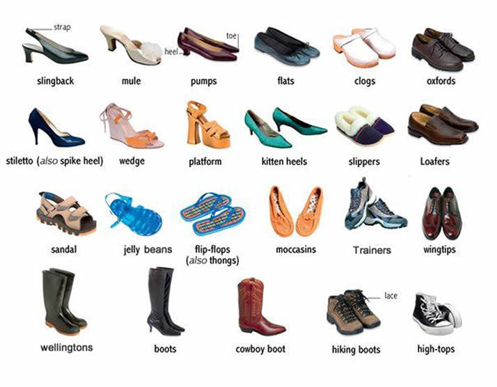
Before I look at famous shoes, I'm also considering how many types of shoe there are and there's quite a lot!

Forest Gump's Trainers

Dorothy's Red Slippers

Cinderella's Glass Slippers

Marty McFly's Self-tying Trainers
By looking at these famous shoes I've started to think of different ideas that I could maybe do in the long run when having to create a narrative! All of these shoes have a story behind them and I feel like I could either go down the route of having a person attached to the shoes, or have them be their own being. I like the idea of shoes having a mind of their own and the Marty McFly's example would be great for this and could possibly be evil shoes.


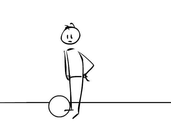
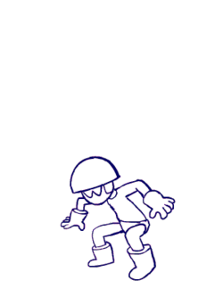 Timing is something that can effect the nature of an animation and this is usually relative to the amount of frames you use, the only way to make your timing effective is lots of practice! So, if you have lots of frames that are drawn very close to one another the animation would appear to be slow and if you have less frames that are set far apart from each other the action would appear to be fast. They both have their uses and a mix of fast and slow timing can add texture and interest to your action. Animation is usually done at 24fps, which is important to think about when coming to create one, and most animations are created on twos, unless you're wanting to slow something down. Ones and twos are how many frames have been drawn in accordance to 24fps, so ones would be 24 drawings per second and twos would be 12 drawings per 24 frames. This is usually done not only to cut down the work load but also so that the animations look a little smoother as sometimes when you drawn on ones the drawings are done so close together that it can look jittery. However, ones can also be used to create fast action such as a scramble. I have put an animation of a character jumping to the left, I liked this example as it uses timing to create different speeds. As you can see he jumps quite quickly before almost floating, then falls slower than he jumped. The use of timing here would have been to use less frames when he was jumping to make for faster action and then more frames for when he's almost stopped in mid air for slow action.