This week I have completed my animation and after speaking to a variety of people I am happy with the outcome, I now have to write my evaluation and then I will be able to hand in.
Adrift - Stacy Straub from Stacy Straub on Vimeo.
Above is my final animation uploaded to Vimeo.
I have found this project to be a great experience for me and I was able to explore an animation technique that I had never used before. Even though I worked on my own on this project I still feel like I learnt a lot and also gained confidence in After Effects.
This week I have spent tidying up all my pieces of work such as blog posts and writing up my evaluation. I was surprised that I was able to have lot of extra time at the end of this module and I felt that throughout the module I was able to manage my time really well.
For the future, this module has helped me to consider mixed media animation instead of sticking to just one at a time. My goals for future projects now is to be able to collaborate with others as I have found that through looking at other people's projects that when you work as a team you are able to achieve more.
Friday, 9 December 2016
Sunday, 4 December 2016
Production Diary 9 - Adrift - (28/11/16 - 4/11/16)

Above is my feedback sheet from a group crit I did earlier in the week. From this I found that people liked my choice of music and felt that the sound worked well, however I could add possibly a warning voice to add to the effect. It was suggested that I reanimate one of the final scenes as it had a little bit of a strange cut and didn't flow as well as it could.
So, taking these points on board I instead changed the layout of my edit instead of reanimating the whole scene as I felt that if I were to do a fade to black it would work a lot better than a straight cut. This way it could suggest the passing of time instead of him continuing to float in a different direction.
I also found a way to create the illusion of stars in space with After Effects, the effect being called CC Starburst, which really helped my animation come together! Below is a preview of what it puts over the animation and you can change the speed, direction, spacing and colour so that it fits.
I also picked my font and title sequence this week which was fun using the CC Starburst again.


I chose a very simple but strong font for my titles as I wanted it to be easily readable, but still in keeping with my theme.

Above is a traditional space font, however I preferred using a font that is more sharp than rounded. Below are the different fonts I looked at.


Even though these were space fonts, they just seemed to look unprofessional to me. I did try and export a title sequence with a space font but because my animation has quite a sombre feel to it, it didn't seem to fit very well.
Friday, 2 December 2016
Comparing Papercut to Other Mediums

With my idea, I wanted a paper/handmade feel to my animation, however I could have used other mediums to create the same effect. South Park, as an example to look at, uses Maya to create their animations but in comparison to using actual paper you can still see that it looks digital. The advantages of using Maya are that you only have to do key poses and the inbetweens are done for you, which creates smooth movement and flexible control over the model.

Looking at another animation from Aardman Studios they created this music video 'The Staves - Winter Trees' that follows the papercut style. This shows how it can be beautifully created using Maya, which I didn't know could work so well. I feel that if I were to redo this project it would be nice to use Maya as they were able to get the effects while still creating depth in their backgrounds. Below is an example of how depth can be lost with cut out as the mug is flat on the table, although it does add to the charm of the animation. This may be a limitation of cut out animation, though you can use these actually to your advantage by creating an effect that other mediums would struggle to produce.

After looking at an interview with the makers they explained 'The challenge of doing such a piece in four-five weeks meant we decided to make it all in CG, which gave us huge flexibility to use a wide range of techniques: from 2D drawn animation and artwork to sophisticated in-house coding in Maya to get all the assets together'. This suggests that possibly CG and Maya would have been a quick option if you know exactly how to use it efficiently, however as someone who hasn't had much experience with it, it may not have been the quickest medium to use. I now understand that 3D does have a lot of potential and can pretty much create every effect, but it still cannot capture the jittery handmade feel of papercut stop motion animation.


References
Egor Shumilov, (2015), 'Reindeer Sweater (Paper Cut Out Animation)'. [Online Video]. 1 September 2015. Available from:"https://www.youtube.com/watch?v=d6OUPBEryXk". [Accessed: 2 December 2016].
Digital Arts Staff, (2013), 'Interview: Karni and Saul tell us about animating an unsettling forest for The Staves' Winter Trees music video'. Available: [http://www.digitalartsonline.co.uk/news/motion-graphics/aardman-animates-unsettling-forest-for-staves-winter-trees-music-video/]. [Accessed: 2 December 2016].
Tuesday, 29 November 2016
Limitations of Papercut Stop Motion
Stop motion in general is something that has it's own set of limitations, it can be costly, time consuming as you have to go back and redo a whole scene if a mistake is made and there are no key frames to make the animation progress smoother.

With papercut animation, it isn't as costly as amateur stop motion, but it still has the same problems with scenes and key frames. The main way that I have found to target this is to use tracing paper to map out paths of motion, this way you don't lose track of where your character is going. In this diagram you can see it's showing to use a circle to plan out the motion of the cats head.

Squash and stretch can also be slightly lost with cut out, it could still be done by making different paper puppets stretched out for affect. However, with 2D animation squash and stretch can easily be achieved and played with as much as desired. It can be argued that squash and stretch isn't used as much in cut out as it loses the effect of a solid object.
In every new frame within stop motion the frame has to be redone by hand, which could be technical limitation. When looking at 3D animation the animator can create key poses and the computer will create the inbetweens for them, whereas this is not possible within stop motion or papercut animation.

Sunday, 27 November 2016
Production Diary 8 - Adrift - (21/11/16 - 27/11/16)
I have spent most of this week actually going through my scenes tweaking and improving them so I can get a better outcome for my final animation. The final scene that I was struggling with last week, I decided to green screen it, which worked so much better! It was quite hard to plan out the rotation of my character, so I used a tracing paper attached to a green piece of card that I planned out each movement on.


I then took the green screened scene into After Effects and used a scan of my background to piece it together, now the animation look so much smoother! As this method worked so well I actually decided to redo another one of my scenes where he jumps out the ship, and I had the idea of making him come towards the screen instead of up then down that didn't really work as there's no gravity in space. After looking at lots of reference videos of astronauts coming out of airlocks, they all just seemed to float straight out so I really wanted this effect.
via GIPHY
via GIPHY
I also decided to float away the spaceship to make it all look more realistic. I had never really used a greenscreen in this way before so I feel like it was a really good learning experience for me and now I can use one effectively in animating.


I then took the green screened scene into After Effects and used a scan of my background to piece it together, now the animation look so much smoother! As this method worked so well I actually decided to redo another one of my scenes where he jumps out the ship, and I had the idea of making him come towards the screen instead of up then down that didn't really work as there's no gravity in space. After looking at lots of reference videos of astronauts coming out of airlocks, they all just seemed to float straight out so I really wanted this effect.
BEFORE
via GIPHY
AFTER
via GIPHY
I also decided to float away the spaceship to make it all look more realistic. I had never really used a greenscreen in this way before so I feel like it was a really good learning experience for me and now I can use one effectively in animating.
Sunday, 20 November 2016
Production Diary 7 - Adrift - (14/11/16 - 20/11/16)
This week I have been finishing off animation scenes and starting to them together in Premiere Pro, I am a little ahead of my original plans but this is good as I will be able to go back and change things I feel it's necessary.
 I am struggling with my final scene at the moment, as it features a pan up from one scene to another. I originally have tried to do this in Dragonframe, but the pan is a little glitchy and not as smooth as I originally planned it to be. This is mainly because as I'm sliding the image up it gets caught on the crane that the camera is attached to and this messes up some of the shots. I might try and move the crane to one side and try this scenes again, however I have also tried to edit it in After Effects. In After Effects it does look okay as I have used a stabiliser but now it goes a little too fast and the frame hold at the end is messed up. Luckily I still have around 3 weeks till the deadline so I should be able to figure it out by then.


Other than that I just have my jump scene left to animate and I will be finished with animating, I have done this scene once but I want to try it again and just see if I can get the jump a little more fluid.
Friday, 18 November 2016
Strike a Pose - Maya Task
I actually enjoyed this study task a lot more than I thought I would and I have learnt a lot about Maya that I didn't really understand last year. I also really liked using reference images to create the poses as it helped with what side Moom would be leaning on and what directions his feet and hands might be facing in the moment.


Reference: Exhaustion


Reference: Pain


This one I got a little more confident and decided to add in a table that he had stubbed his toe on. I feel like his leg was a little too skinny for this pose as you can barely see what he's holding.
Reference: Sadness


This pose was quite hard to actually get Moom to be on all his limbs at once but I pretty much got it.
Reference: Surprise

Surprise is quite a funny pose and it was hard to get the reference of this face for this as my eyebrows are almost facing down but moving them just a little too much would make Moom look evil and not happily surprised.
Reference: Happiness


I feel that I need to light this scene again before final submission, however I went all out and put Moom on a dancefloor for this one. It was quite hard to use my image as reference as I'm actually in motion in the photo, however I really felt like it captured the emotion really well even though I am moving. If Moom had some long flowing hair I think it would be easier to show him in movement.
Terry Gilliam - Research
T
Terry Gilliam talks about the limitations of cut out animation, but also says you can use this this to your advantage. He explains that you can do really quick and fast movement very easily with cut out animation and can't really do very fluid and gentle movements, so it works really well with crazy narratives or movements.
Something I also found is that he uses airbrushing to create a 3D effect so that everything isn't always flat, which I think is a really clever way to manipulate the viewers perception. He also talks about the lighting having to be as high up as possible to avoid as much shadow as possible.
Another tip I got from this way to black the edges of the pieces you use in paper cut animation so that when you come to animate you won't get white flares in your final animations. This is really useful and I will definitely do this to my puppet and different pieces, this is something I would never have thought of! He also keeps different parts of his animation in envelopes so that the little pieces don't go missing and hr can just pick one up and use it as he pleases.
Finally, Gilliam talks about shadows in cut out animation that are always a problem so he uses a piece of perspex on top of his pieces so that they are flat and not curled up at all when shooting. I really like this idea, however I don't really know where I would get that kind of material from, I may try and look around for some glass to use instead!
Watching this DIY with Terry Gilliam has actually helped me a lot as I was struggling with how I was actually going to animate without having the animation come out with lots of shadows and not looking as I wanted it to. It also has helped me understand a little better the limitations that cut out involves, but there are ways around this. I love the work of Terry Gilliam and even though the style is quite different to the style I am going to be using I still feel like this has helped me not make the vital mistakes that can be made in cut out animation.

Do it in 10 - Empty - Submission - 18/11/16
So today I submitted my animation early to Do it in 10 and I am quite happy with the outcome, I showed a few people before submitting and everyone found that they understood the narrative. I did end up adding in some extra effects to try and make the comedic value heightened, for example adding in a colour drain when the camera goes to zoom into the donut. These were post decisions, however this sometimes happens when getting peer feedback which is where I got the ideas. Below is my final animation!
Empty - Stacy Straub from Stacy Straub on Vimeo.
Empty - Stacy Straub from Stacy Straub on Vimeo.
Do it in 10 - Empty


Here are some doodles I did to come up with different character designs before I settled on two I liked.

This was my first storyboard, but I found that it was a little too complicated considering I only had 10 seconds to do it in. So, I decided on a different storyboard.

This was my final storyboard I came up with and used in my production, I found that the simpler version of my idea was better considering the time and the fact I have other work to juggle.

Here was the first idea I came up with for my Donut character, I later changed his eyes to be like the coffee cups eyes as I wanted them to look similar. I took inspiration from my moodboard when creating him.
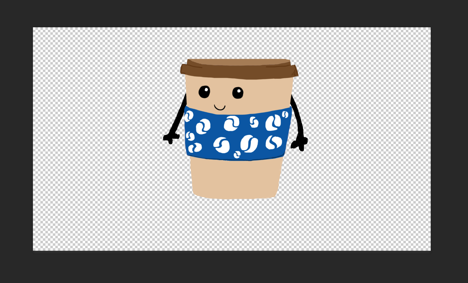
Above is my final coffee cup character design, which I really liked and I gave him arms so that he could have some type of expression. As I was using DUIK to rig these characters I made sure all the pieces were on separate layers so rigging would be easier.

Here is the rig of my characters and I found that DUIK worked really well for the idea I wanted, I really liked how you can make the layers follow each other so if I squashed one layer the others would also squash.
Sunday, 13 November 2016
Production Diary 6 - Adrift - (7/11/16 - 13/11/16)
This week I have been animating, yay! I was really excited to start animating but also a little nervous as I had never done papercut animation before, but so far it has been going really well.
→ My next steps are just to keep on animating all my scenes, scan in all my painted backgrounds and try and figure out the last scene as I'm struggling with the transition from one side of the scene to the other. I may have to move the stop motion studio around a little as I'm finding it hard to move the image on one table as it's A1. I also want to take multiple shots of my animation scenes if I have time, this way I will be able to critically choose which I think work better and which weren't animated as well as I feel they could have been.
Before all that I went into the stop motion studio and did a little test to see what it was like and I made my character do a jump. I could then start to understand the timing of stop motion and here I felt my character needed a little more squash and stretch even though this is difficult with papercut animation.
This is one of my favourite scenes I have done so far and I really love the look of it. I am struggling with trying to make smooth motions with this kind of animating and I knew this would be one of the main struggles I faced. I have found that you need to take a lot of frames for this effect and tiny movements between frames. I have also found it helps to use grids to plan out where your action is going so you can follow this.
→ My next steps are just to keep on animating all my scenes, scan in all my painted backgrounds and try and figure out the last scene as I'm struggling with the transition from one side of the scene to the other. I may have to move the stop motion studio around a little as I'm finding it hard to move the image on one table as it's A1. I also want to take multiple shots of my animation scenes if I have time, this way I will be able to critically choose which I think work better and which weren't animated as well as I feel they could have been.
Friday, 11 November 2016
DUIK Task

Learning DUIK for me was actually quite easy and it clicked in my head really well, below I created my little fish character that I rigged quite quickly. I made him human shaped so that it would be a simpler rig and it went quite well, however the only thing I would have changed would be to overlap the arms and legs with the body in photoshop a little more as they come away in the final animation. DUIK is a great tool for animating and I will definitely be using it more as it's quick and it makes sense to me as to how to use it. The most important thing with DUIK is the labelling, if you don't label everything really precisely then it all gets too confusing and the layers get muddled up, it's also useful to order them how you will need them. For example, when creating bones order it arm, elbow, wrist, so that when you come to rig it's all really easy to lay out. I've also included my final animation below.

Thursday, 10 November 2016
Affter Effects - Puppet Master
For my puppet master animation I went for a simple idea that I could include some fun into.
I decided to go for a arm wave that I could loop and have myself on a dance floor.
The puppet tool is something I have used in the past and I have found that as an animation medium it doesn't work very well if you want to achieve a realistic look. On the other hand, if you need a funny looking wobbly animation then this is definitely the tool to use! What I learnt from this task was how to use the starch puppet tool a little better as I was unsure on how this worked, after this study task I was able to use it effectively so that certain parts of the image didn't move with the other parts. I feel that learning how to use use the basics of puppet tool is important to understanding other animation mediums such as DUIK.
If I were to do this study task again I would have challenged myself a little more and maybe tried a walk cycle even though it would be hard to achieve. Using the puppet tool in the future will probably only be for moving things a small amount, as it doesn't work as well with lots of movement.
I decided to go for a arm wave that I could loop and have myself on a dance floor.
If I were to do this study task again I would have challenged myself a little more and maybe tried a walk cycle even though it would be hard to achieve. Using the puppet tool in the future will probably only be for moving things a small amount, as it doesn't work as well with lots of movement.
Sunday, 6 November 2016
Production Diary 5 - Adrift - (31/10/16 - 6/11/16)
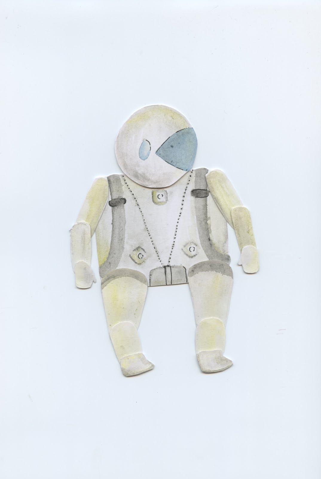
This week I began making my final puppet and painting backgrounds as I want to start animating next week. On the left is my final puppet, however I have to make the back version of him for the first few shots still. I also want to make multiple hands, boots and helmets so that he can face in different directions.


 I also wrote my script for my animation as good practice for script-writing, which I really enjoyed doing! I liked being able to emotively describe the action and emotions of the character so that anyone who read it could understand deeper than seeing a storyboard.
Above are some of the backgrounds I have been painting this weekend ready for animation! I just have to finish a few of the inside the ship back grounds and below is a draft of one of the scenes I am painting out properly onto A3 watercolour paper at the moment. I wanted to use water colour paper for the inside scenes so that it has lots of texture and a different feel in comparison to outside the ship.
Subscribe to:
Comments (Atom)