Sunday 29 November 2015

Tarentino's Gods Eye

As one of my inspirations for shot types is Quentin Tarentino as one of my favourite directors and I decided that I was going to use some of his famous shots in my own animation to make it overall more interesting to watch. I really love the God's Eye POV shot and I have decided to use it when my Lumberjack character is looking up at the tree he's about to cut down, I feel like this shot type really emphasises the vulnerability of a character as well as giving a better sense of the mise-en-scene.


Famous Shoes

I decided to look at some famous examples of shoes in order to inspire myself into what I want to create with my 24 drawings. I need to consider; types, styles, classifications, shapes, similarities and differences in shoes. 


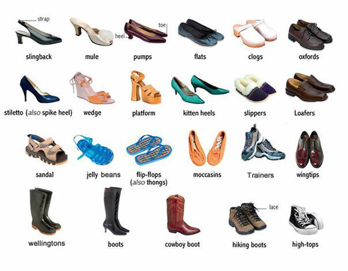
Before I look at famous shoes, I'm also considering how many types of shoe there are and there's quite a lot!
 Forest Gump's Trainers
 Dorothy's Red Slippers
 Cinderella's Glass Slippers
 Marty McFly's Self-tying Trainers

By looking at these famous shoes I've started to think of different ideas that I could maybe do in the long run when having to create a narrative! All of these shoes have a story behind them and I feel like I could either go down the route of having a person attached to the shoes, or have them be their own being. I like the idea of shoes having a mind of their own and the Marty McFly's example would be great for this and could possibly be evil shoes.

My Animatic for The Other Side


This is my animatic that I created in order to plan out my final animation and get the timing of the shots right so that I didn't waste any time when coming to animating. I found that this method was much more easier than doing a storyboard as it really allowed for seeing what the final animation would feel and look like without even starting on it yet. Looking at my animatic I feel that the timing goes well with the amount of shots I put in, originally I had put in more but after decided that it didn't need to be so complicated. I put in a few sounds to make the animatic more interactive, however I feel that some of them are going to change quite a lot in my final animation, such as the noise of the lumberjack trying to pull out his axe. I am now ready to animate and I'm going to make sure that I keep on referring to my animatic to ensure I don't waste time by drawing extra seconds here and there that I do not need!

Friday 27 November 2015

The Other Side, Production Diary - 27/11/15

Today I carried on with my animating and I got to colour in the first two seconds of my animation and move on to the next few seconds. I feel the main thing I need to keep remembering is secondary action as I feel myself slipping out of remembering this principle and some actions can seem a bit robotic and not natural. However, I am making sure to constantly line test after I feel I've made some sort of progress. As long as I just carry on as I am, I'll hopefully get a reasonable amount of my animation done before we break up for Christmas, which is one of my main goals.

Tuesday 24 November 2015

The Lumberjack Final Design

Before I could go on I had to come up with my final design for The Lumberjack character, and here he is! I made his colours match those on the backgrounds so that it is all matching, I decided not to got with the emblem on this outfit to make the animating slightly easier as this might have made it more complicated. Overall, I like how he looks, he's nice and simple and I'm happy with him as a character.


Backgrounds for The Other Side!

Here are the final backgrounds I've been working on for my animation!
I made sure to have a magical looking colour palette for these so that it gives the right mise-en-scene, and I looked at the concept artist Mary Blair for my main inspiration.


The Other Side, Production Diary - (24/11/15)

My Interim Critique was today and I had set up a presentation and animatic to gain feedback from, it went well and I received positive feedback! The feedback I recieved was that I have a good story and the timing in my animatic worked really well, this was the main thing I was concerned about. I also got feedback that my developmental work was well documented and that it's clear that my ideas have developed over time. I am going to take away from this feeedback to really keep doing what I'm doing and to make sure that I really stick to my plans and avoid straying off so that my project is successful. I also made lots of progress today with my final animation. After recieving the feedback I went straight on and started my animation, I was able to finish all my background to animate on top of as well as start to animate my first scene. I managed to get 2 seconds done but not fully coloured up yet, I'm going to leave that til the end!

The History of Animation NOTES

Pre-Film - c. 1650-1899

  • 1815 - Magic Lantern - early predecessor to the projector (2 slides of glass back and forth)
  • 1824 - Thaumatrope - A disc of card that displays an image when it is rapidly spun
  • 1831 - Phenalistoscope - A disc with an image sequence on one side and radical slots, viewed in a mirror
  • 1834 - Zoetrope - Similar to the Phenalistoscope but a cylinder rather than a disc, this is where animation really started to kick in
  • 1868 - Flip Books - A book which when flipped through, generates an illusion
  • 1877 - Praxiniscope - An improvement on the Zoetrope using central mirrors instead of slits, neater way to see
Silent Era - 1899-1924 (Artists began to use film to record their animations and were often accompanied by pianists!
  • 1899 - Arthur Melbourne-Cooper - Matches an Appeal, this is the first known animation and it was British
  • 1906 - J.Stuart Blackton - Humerous Phases of Funny Faces, pioneer American for animation and this is traditional animation using film, he uses chalk and cut outs
  • 1907 - Katsudo Shashin - Unknown Author
  • 1908 - Emile Cohl - Fantasmagorie, this was considered to be the first narrative animation
  • 1910 - Ladislaw Starwicz - Beautiful Lukarida, an early example of puppet based animation
  • 1914 - Windsor McCay - Gertie the Dinosaur, Real example of traditional animation where they actually have character design
  • 1917 - Quirino Cristiani - El Apostol, 70 minutes of cut out animation. another pioneer of animation as this was the first feature length
  • 1921 - Walter Ruttman - Lichtspiel Opus I, pioneer of abstract animation
  • 1923 - Walt Disney - Alice Comedies, on the corner of the golden era, this was Walt Disney's first project that composited real action with animation
The Golden Age - 1923 - 1960s (The animation industry took a big hit when television became an affordable alternative to going to the cinema, talkies came in)
  • 1924 - Max & Dave Fleischer - Song Car Tunes, the first series of animation to have sound
  • 1928 - Disney - Steamboat Willie, first animation with completely synchronised sound
  • 1931 - Quirino Cristiani - Peludopolis, the first feature length animation with sound at 70 mins
  • 1932 - Disney - Flowers & Trees, brings in colour to animation, RGB three-colour technicolour, and had a very limited colour palette but won the first Oscar for animated film
  • 1935 - Tex Avery - Gold Diggers of '49, first animation from Warner Bros
  • 1937 - Disney - Snow White & the Seven Dwarves, the first feature length film with three strip technicolour, very popular and demonstrated that animation should be taken seriously as a form of media
  • 1945 - Mitsuyo Seo - Momotaro's Divine Sea Warriors, first feature length anime

Tree Spirit Final Design!

Here is my final design for my Tree Spirit character! I really wanted this character to look very feminine and took inspiration from images I had found from Pinterest and online sources. I feel like she looks how I want her to and hopefully my animation will be successful in the way that I will be able to keep her consistency to whole time.


Monday 23 November 2015

Inspiration for The Other Side

As part of my inspirations I looked at different cartoons that I liked and looked at how their layouts were to inspire my project. First I look at Looney Tunes and I really loved how they used simple and bold characters that would be easier to animate alongside soft, subtle backgrounds. This gave me the idea of putting a lot of time in to the backgrounds in my animation to make them look appealing and I felt that by doing this I would be able to make my animation look more appealing and interesting to look at. Below you can see how Bugs Bunny and Porky Pig really stand out against the background, which uses pastel and light colours in order to not take too much of the audience's attention. I am also interested in using light colours in my backgrounds so that I can create much the same effect.

Next I looked at other animations which used the same technique and I found that this was a common technique that is used! Below I have put a few examples of other cartoons and animations that use beautiful backgrounds behind their animations to bring it all to life. Without these backgrounds I feel that the animations would look either boring or out of place and wouldn't really establish the narrative that the animators are trying to get across, so the backgrounds are really an important aspect.


Mary Blair

For one of my main design inspirations I decided to look at one of my favourite concept artists Mary Blair, who worked for Disney in the earlier days. I really like her work because of her use of colour and it was very inspiring to me when looking at her artwork to create a similar style for my animation. By doing this, I am able to think carefully about my colour scheme to bring my whole animation together and make it more professional. Below are a few examples of Mary Blair's work and I particularly like how she layers up her images and after researching I found that she uses watercolours, pastels and cut out shapes to create her images. I have created a scene (shown below) much like Blair's using her materials just to test out whether I really liked her technique however, as I am creating a 2D animation using Photoshop this will not be possible to me however I plan to create a scene much like Blair by using layers in Photoshop.


Here is my inspired piece.


Friday 20 November 2015

The Other Side, Production Diary - (20/11/15)

Today, I have learnt about the history behind animation and how animation has evolved over the years which was early interesting. We went through the Silent Era to the Golden Age and I am going to continue my research into the Silver Era of animation so I get an even better understanding of the history. My favourite part of the history was looking at the Golden Age as I prefer the animations that have sound and are more interactive, although it was still interesting to look at the older forms of animation and the ways they figured out how to make images move; such as tying a piece of card between two pieces of string. My goals now for the rest of the day is to get a bit more development done and I plan to digitally draw up some of the backgrounds on Photoshop for my animation to see if I want to do it digitally or paint them and scan them in to animate over the top. Finally, I am going to work on looking into audio style as this is something I am yet to consider for my animation.

Tuesday 17 November 2015

Animatics in Animation

Animatics are basically a moving storyboard and I decided to look into the history of them and why they are used in order to inspire me and so that I have a better understanding of them. So, when they were first introduced, animators would actually just videotape the drawings but now it has become a lot more digital and we can used editing software in order to create a more precise animatic and include a soundtrack. I found a couple of animatics that I liked and have put down below and by looking at existing animatics it helps to inspire my own. Animatics are really useful as they allow animators to see what works and what doesn't before going in and spending lots and lots of time animating these scenes. I feel that they save a lot of time and a quick way of almost seeing how to animation will look in the end without it actually being any way near finished. Without using an animatic the animations could possibly not work as well and also they allow for feedback before the animation has gone into the production stage.


Friday 13 November 2015

The Other Side, Production Diary - (13/11/15)

Most of my ideas I feel now are pretty solid and I am happy with the narrative I have settled with so I felt it was time to start on a rough storyboard, which is what I did today. I feel like this went really well and I am taking inspiration from Disney for the look and feel of my forest in my animation so I was sure to look at lots of different Disney storyboards on Pinterest and online to see how they laid out forests. I also looked at lots of different shot types such as wide shot, god's eye POV shot and different angles so that I could portray my characters in the right way. I sketched a storyboard up and I'm quite happy with the results. I then went on to create my first draft of my animatic and this went quite well as I was familiar with the program Premiere Pro so I didn't have any technical problems. After chatting with Mat he has suggested I take a few shots out as it's too complicated for the time I have so I'm going to have a look over the first shots of my lumberjack walking through the forest as I have a lot of shots for that scene.

Tuesday 10 November 2015

The Other Side, Production Diary - (10/11/15)

I did some character research today and I decided to go with a different idea than I had originally come up with. This was because I wanted to create a narrative that was simple yet had some humour to it originally and if I would have gone with the idea of having a little cow jumping over a fence it was a little too simple and didn't have enough narrative. Instead, I have decided to go with a story of a lumberjack going through a forest and he sees a beautiful white tree, which he then goes to chop down. Into his first chop a the tree his axe gets stuck and this wakes up the magical tree spirit that he's trying to chop down. Her reaction is that she decided to turn the man into a frog and he jumps out of a pile of clothes. I am also thinking of adding a small Easter egg into the animation where I could possibly put a crest on the lumberjack's clothing to hint him being of royalty, possibly a prince?


Thursday 5 November 2015

The Other Side, Production Diary - (05/11/15)

Pinterest is a great website for coming up with ideas and creating inspiration for yourself so this is what I have been focused on today so that my ideas become solid. I am thinking about changing my original idea as I'm not sure I like it very much. Below I have screenshotted my Pinterest board to show the kind of images I'm looking at for inspiration and I am really liking the idea of having a lumberjack cutting down a tree and having a twist in there somewhere. I also have been looking at different storyboards and how they can be used most effectively. Below you can see a shot of a Snow White storyboard and I thought this was interesting because you can see how they have put a square to the camera movement. By looking at Pinterest I know that I want to look at a new idea and really focus on getting a solid and interesting storyboard.


Tuesday 3 November 2015

MAID OF THE DEAD


As I looked at a claymation that was American and quite gory, I decided to look at a Japanese one to compare the two. In this animation it uses gore but then makes it comedic and I have found that the Japanese claymation includes a lot more gore than say the American one; like I predicted. I like this animation more than the other because it has a better narrative to it, as well as the characters having more character even though they don't have any introduction like the other. I found that this one reaches a larger demographic, still older, as it doesn't have a soundtrack that could influence the audience's views and it's also in English and Japanese so can be understood by a lot of people. This animation is successful as it is funny, which makes it more memorable and makes people want to see more like this. I also like the fact that it's not too long and manages to keep your attention without getting too complicated. The medium used is great again because anything goes with clay so unrealistic things can be made to look relatively realistic without grossing someone out too much, like pulling someone's guts out. Overall, I feel like this claymation is much more successful in the way that it has a better narrative with humour instead of being a dramatic horror scene in a typical setting.

Love Automatic - NIGHTMARE [official video (18+)]


This was a claymation that was created as a music video, which I came across when looking at a few different claymations on YouTube. I really liked this video as the use of clay really helps create every effect successfully within the video, if they used any other medium it might not have worked as well as they were able to create melting bodies ect. I feel like there isn't a message behind this video, but instead it's something different to attract audiences to watch the video even if they didn't know the song, therefore making it more well-known. The demographic for this video is clearly an older audience as it has gore in it, but it might have also been considered that the video had to be aimed at the same audience the music would have been so they would work together effectively. I think this is an American made video, which is clear from the horror clichés that are used and often found in American horror films. This might differ if a Japanese company produced this video as comparing their horror genres there is a lot of differences to be found. As the band are also American it would have made more sense for American animators to create this.

ATORMENTA Sand Animation


Sand animation is something that is quite different and really shows how animation can come in forms that may not seem very obvious. This animation is a very short one so there isn't much of a message apart from a narrative about a little girl, although it still manages to use it's medium to create the atmosphere of a storm successfully. Target audiences for this animation isn't so clear either, mainly because it is so short, however it would likely be for an older audience due to the twist in the narrative. I like this animation mainly because it was made entirely with sand and salt and the technique is really interesting to me.

Ideas for 'The Other Side'


These ideas are just some basic ones that I have not yet developed any further, I am not sure yet whether or not I am happy with any of them and so that I stay inspired throughout the whole project I want to find a subject that really interests me. I feel that by looking at Pinterest it will help me gain even more ideas and maybe develop some of the ones I have already come up with!

The Other Side, Production Diary - (3/11/15)

Today, I was briefed on a new project called Process and Production and my main task for this project is to basically come up with a 25 second 2D animation that has a narrative. I am excited to start this project as I feel that it has quite a lot of freedom with it as I can literally do anything that's relative to the words 'The Other Side'. I have come up with a few ideas today after doing a few brainstorms and I'm not sure which one to settle on yet and I have also done a few sketches to get a few ideas going and hopefully I'll be focused on my subject soon!

Line Test for Flower Happiness Animation


This was my first line test to ensure that my 2D animation was going right, this is 12 frames of the final 60. I feel that looking back at it to make my animation better next time I could make the feet more grounded and keep an eye on this just to make the characters feel more real. Also, something I noticed was the fact that the male character's head floats back and forth at times which could be something else to keep in mind when creating my next animation so that my animations look more precise.