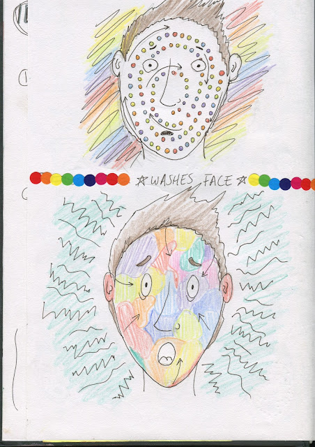
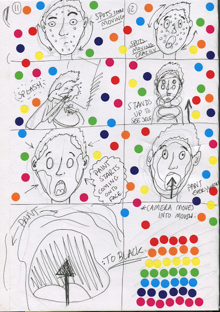
I was given a new project where I had to create my own pixilation and to start I decided to think of a few ideas before I went into more detailed planning. My first idea was to had a bed have a mind of it's own and trap whoever lies in it but I felt like there was problems with this idea. Not only did I think it was quite a plain idea without much creative flair but also I couldn't find an ending with it where the story develops. So, I tried to think of another idea and came up with the idea for human verses parasite where someone would be infested by colourful spots. This then went on to be quite crazy and colourful and I wanted to also add paint into the animation. Spots was the idea I went for in the end and I'm glad I did as I feel like this idea was much more creative and fun. Firstly, I created a few sketches before going on to create a full storyboard, which I covered in spots for a bit of fun. This idea went really well, however I did face some creative changes as I was filming it, such as changing the way the paint was on the face and the way the spots moved in each shot.
Friday, 23 October 2015
Planning for Pixilation Project
I was given a new project where I had to create my own pixilation and to start I decided to think of a few ideas before I went into more detailed planning. My first idea was to had a bed have a mind of it's own and trap whoever lies in it but I felt like there was problems with this idea. Not only did I think it was quite a plain idea without much creative flair but also I couldn't find an ending with it where the story develops. So, I tried to think of another idea and came up with the idea for human verses parasite where someone would be infested by colourful spots. This then went on to be quite crazy and colourful and I wanted to also add paint into the animation. Spots was the idea I went for in the end and I'm glad I did as I feel like this idea was much more creative and fun. Firstly, I created a few sketches before going on to create a full storyboard, which I covered in spots for a bit of fun. This idea went really well, however I did face some creative changes as I was filming it, such as changing the way the paint was on the face and the way the spots moved in each shot.
Subscribe to:
Post Comments (Atom)
Blog Archive
-
▼
2015
(71)
-
▼
October
(34)
- The European Refugee Crisis and Syria Explained - ...
- Hyrule Warriors - Opening Cutscene (Japanese Wii U)
- Fable III - Opening Animation
- Father and Daughter - Dutch Short Film (2000)
- OREO Canada Wonderfilled Anthem (Full TV Commercial)
- The Girl Effect - The Clock is Ticking (Infographic)
- Grave of the Fireflies - Studio Ghibli
- Designed by Apple - Intention (2013)
- The House of Small Cubes (La Maison en Petits Cube...
- Appeal or Character Personality - Principle 12
- Solid Drawing - Principle 11
- Exaggeration - Principle 10
- Timing - Principle 9
- You & I (PIXILATION)
- Peter Gabriel - Sledgehammer (PIXILATION)
- Norman McLaren - Neighbours (PIXILATION)
- Secondary Action - Principle 8
- Photos From Filming the Pixilation - SPOTS
- Planning for Pixilation Project
- Arcs - Principle 7
- Slow Out/Slow In (Ease Out/Ease In) - Principle 6
- Follow Through & Overlapping Action - Principle 5
- Straight Ahead & Pose to Pose Animation - Principle 4
- Staging - Principle 3
- Anticipation! - Principle 2
- Squash and Stretch - Principle 1
- My Storyboards!
- John Nevarez - Storyboard Artist
- South Park Storyboards
- Guillermo del Toro's Notebooks
- Kiki's Delivery Service Storyboard
- Paperman Short Film
- Study Task - Pendulum Swing
- Flipbook Comparison
-
▼
October
(34)


No comments:
Post a Comment