Here is my turn around all cleaned up and I'm quite happy with it, I still feel like I need to alter a few things here and there as her eye seem to shrink a little in one frame. I also need to concentrate on getting her leaves on her head to be consistent and to do this I'm just going to re-watch my turn around after each small alteration so that I get it to where I want it to be. Something else I struggled with was the proportions of the leaves and making sure they did not change in size as she turns to the back. I feel that keeping proportion is something that I definitely need to improve on, and to do this I will just have to keep practicing. I also need to tweak the bottom of her dress as some of the frames have a rounded bottom whereas most of the dress is jagged. My next steps are to colour my pixie as well as tweak her to make sure she is always constant in her proportions.
Friday 29 January 2016
Tuesday 26 January 2016
Turn Around - Rihannon Rose
For my visual language unit, I was tasked to create a turn around and so far it's been quite challenging. The main thing I have struggled with is the angles where my character is facing to the back, this is because I'm not used to drawing character in this position but I think by practicing this it will improve the way I can frame my shots. I started by drawing the first 12 images by hand so that I could easily erase or redraw the character until I got it right. This helped me to have a good idea of what I needed to draw before I went to digital. Below are the 12 images I drew before I move onto digitally draw my character.
Monday 25 January 2016
Creating Rihannon Rose!
The first steps to creating my character was to re-draw out her proportions in a diagram as well as her muscle mass. I found this was really useful as drawing her real size onto paper then allowed for me to measure the lengths I needed from it.
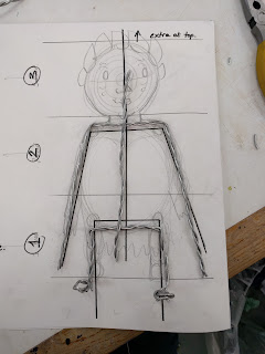 Here you can see that I made me skeleton from wire and here I lay it on top of my drawing so I could see that it matched up perfectly. There were two different types of wire available for me to use, thick and thinner wire. However, I found that using thicker wire where my character needs support, such as her spine and legs is a better option and using the thinner, easier to move wire in the arms where there will need to be more motion.
Here is my skeleton again, and my next step was the form the muscles and body onto my frame!
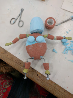
Here you can see that I created my body mass using a mixture of Styrofoam and milliput. The styrofoam worked best for bulky areas such as the chest as it was solid and easy to carve into my desired shape and the milliput was good for covering sharp wires and sticking the bolts on to the feet. I attached bolts to my character so that it would have a base to stand on when coming to animating in a later stage. I also wrapped the styrofoam in rough plaster material, and this was to ensure that the plasticine would stick to my model effectively and easily.
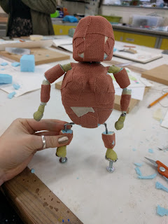
Here is the final model before plasticine and as you can see it is completely covered in the plaster material!
So my next steps I began to create my character with plasticine and this was quite challenging at first as I wanted my character to look smooth but just a wrong slip of the finger and it could mess up the whole face. I really enjoyed the whole process, and after a while of modelling I started to get better and more confident. I found that rolling out the plasticine and then layering it on piece by piece really helped for my to get my character modelled quicker.


 Here you can see that I made me skeleton from wire and here I lay it on top of my drawing so I could see that it matched up perfectly. There were two different types of wire available for me to use, thick and thinner wire. However, I found that using thicker wire where my character needs support, such as her spine and legs is a better option and using the thinner, easier to move wire in the arms where there will need to be more motion.
Here is my skeleton again, and my next step was the form the muscles and body onto my frame!

Here you can see that I created my body mass using a mixture of Styrofoam and milliput. The styrofoam worked best for bulky areas such as the chest as it was solid and easy to carve into my desired shape and the milliput was good for covering sharp wires and sticking the bolts on to the feet. I attached bolts to my character so that it would have a base to stand on when coming to animating in a later stage. I also wrapped the styrofoam in rough plaster material, and this was to ensure that the plasticine would stick to my model effectively and easily.

Here is the final model before plasticine and as you can see it is completely covered in the plaster material!
So my next steps I began to create my character with plasticine and this was quite challenging at first as I wanted my character to look smooth but just a wrong slip of the finger and it could mess up the whole face. I really enjoyed the whole process, and after a while of modelling I started to get better and more confident. I found that rolling out the plasticine and then layering it on piece by piece really helped for my to get my character modelled quicker.
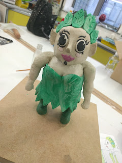
So, here is my final model of my character Rihannon Rose! I am really pleased with how she turned out and to finish off I rubbed on olive oil to the plasticine to smooth it out and it worked really well, however you only need a tiny drop for a large area as it's easy to put too much on. I feel that I have really learnt during this workshop and I now feel much more confident with the stages of physically making a character.
Wednesday 20 January 2016
Research Into Turn Arounds
For the You Spin me Right Round task we have been asked to create a turn around of the character that we created and I thought that it would be beneficial to look how professional turn arounds for famous characters!
I liked this turn around of Angelica from The Rugrats as she has quite crazy hair, this turn around is useful as it should exactly how her hair sits. Of course, I have to animate my turn around and this is a series of drawings but I plan to draw out each pose before moving to animating anyway.
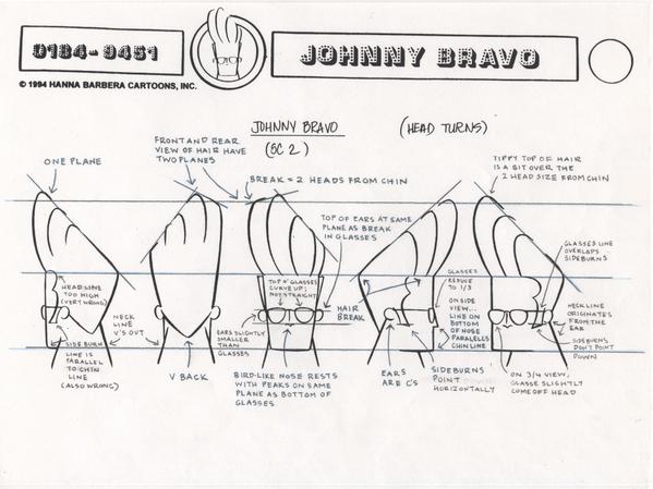
I also really liked this example of Johnny Bravo where they have done a singular turn around of the head, this might be a good idea for me to do as it allows for you to plan out complicated hair. As my character does have complicated hair it may benefit me to focus on a more close-up turn arond before going for the full thing. The notes on this turnaround are really helpful too as they go into lots of details that you may have missed on the first look, for example it says that the 'tippy top of the hair' reaches above the top line.
Below are a few more turnarounds that I just liked looking at for inspiration!


I liked this turn around of Angelica from The Rugrats as she has quite crazy hair, this turn around is useful as it should exactly how her hair sits. Of course, I have to animate my turn around and this is a series of drawings but I plan to draw out each pose before moving to animating anyway.

I also really liked this example of Johnny Bravo where they have done a singular turn around of the head, this might be a good idea for me to do as it allows for you to plan out complicated hair. As my character does have complicated hair it may benefit me to focus on a more close-up turn arond before going for the full thing. The notes on this turnaround are really helpful too as they go into lots of details that you may have missed on the first look, for example it says that the 'tippy top of the hair' reaches above the top line.
Below are a few more turnarounds that I just liked looking at for inspiration!


Friday 15 January 2016
Nausicaä of the Valley of the Wind Design Sheets
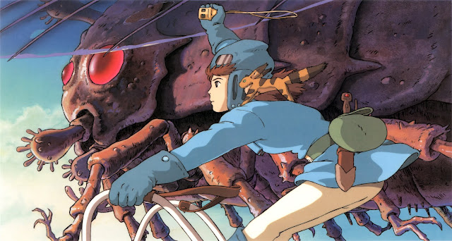
For part of my character design project I wanted to look at some design sheets and look at the different ways that professionals plan out and develop their ideas of characters. Below are the design sheets for Nausicaä of the Valley of the Wind an animation created by Studio Ghibli and I felt that the design sheets for this animation would be quite interesting as it features a lot of fantasy characters.
I first noticed that a lot of design sheets start off with lots of concept art so I feel like it would be a good idea when coming to create a character and narrative around that character to first draw up some concept art. I feel like this helps you to establish the type of character they are a little better as you can start to imagine the world they live in.
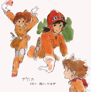
I really like the use of paintings in design sheets as I feel like you get a better sense of the character from a watercolour that you can't really get from a simple line drawing. The action poses for Nausicaä on the left are really fun and fluid and by using the watercolour it really shows the way her hair flows and the quirkiness in her personality.
The image below I liked because it shows all the different characters together even though they may not be in the same scenes together it allows for a detailed account of the sizes of the characters in comparison to each other.

Thursday 14 January 2016
Production Diary, The Other Side - 14/01/2016
The deadline is tomorrow and today I finally finished off my animation! I feel so relieved and all I have to do now is write my 500 word evaluation and finish any bits and bobs that I have to complete my project. The sounds that I had to gather for my animation were actually quite hard to source and I found that even looking through the BBC sound library I could find sounds that quite fitted the way I wanted them to. I instead went and looked through online sound banks that were royalty free and eventually found the sounds that I liked, however it took me a long time. Possibly in the future I will want to record my own sounds so that they are exactly what I want them to be and this would possibly make my animation more successful. The only thing now looking back at some of my shots is that I could have cut out the close-up of the axe as this shot isn't really necessary for the audience to understand that my character is a lumberjack, but this is just another thing I can remember for future projects! Below is my finished animation, hooray!
Tuesday 12 January 2016
Production Diary, The Other Side - 12/1/2016
My final task to complete all my scenes for my animation was to re-make the walking scene as I was not happy with the outcome. Today I managed to complete this scene and now I can add it in to my final edit! Below is the comparison between the old scene and the new one.


I feel like even though my walk cycles aren't perfect and I need much more practice doing them, my second attempt was better than my first time trying to create one. My main problems were that in my first attempt my character walks quite like a robot, whereas my second walk cycle seems to be a little more fluid. To improve I am going to continue to practice creating walk cycles as I find them quite difficult but they are a good thing to practice in order to improve my animation skills. I am happy that I had redone this scene as the first cycle I was very unhappy with. My second cycle does have quite a rigid movement and to improve it I could have made his body move with the motion a little more, but this is all things I can take away and think about more carefully next time!
The Incredibles - Character Design

The character design in The Incredibles is a very strong example and I felt it would be useful to go through and look at the way the characters were developed. To the left is an early example of Bob, the main character, and I liked this because it really shows the way the character is feeling. He has been illustrated looking to the side and it suggests to me that he isn't happy with himself or his life, the way the character is standing or posing can suggest a lot about a character and this is something that I need to work on to ensure that the characteristics of my own characters are noticeable straight away. In the notes around Bob it says 'little colour in his life' and 'light colour make him look weak' and I felt like this was important as colour are another thing that make a huge impact on characters, as he is blue and blue is known to be a sad and cold colour it would drastically change the mood if he were to be dressed in red for example.
One of my favourite characters in this animation is Edna Mode, a half-japanese/half-german fashion designer. I really liked her design sheets as she is such an 'out there character' and below I have put a few images of her being developed. In the middle image you can see that they tried used different shapes to form her body and head and I have also used this technique in my own project to create my character. What I notice here is that they have actually used two shapes to form her head and I only used one shape and experimented with that. To develop my skills further I feel I should experiment trying to use lots of shapes when creating my next characters.

Friday 8 January 2016
Production Diary, The Other Side - 08/01/16
As the deadline for the project next week, I spend all day putting my animation together to see if I had correctly timed my shots and to see how it al fitted together, if any didn't fit or needed tweaking I would then have time to change them. I have found that some of my clips are not long enough to register to the audience when being watched through, which is very important if I want my animation to be understandable. To fix this I'm going to go through the shots and make each beginning and end longer so that they can have pauses instead of going straight into action. This will hopefully help the flow of the animation and make the shots more understandable. I also found that in my walk cycle, even after trying to tweak it, it still does not look right and I am considering reanimating the whole thing in order to improve my animation. Finally, what I found after putting all of my shots together was that some of my shots look really nice ascetically, whereas others do not and this is because as time went on I actually found my self improving and I was able to animate better than I did at the beginning. So my next steps are to fix the shots that are too short, fix up the shots that I think could look nicer and smoother and finally put in sound to wrap all of my animation together!
Thursday 7 January 2016
Storyboarding in Animation
For my shoe project I am to create a storyboard in order to tell a narrative about a shoe and to help me create the best storyboard possible I want to revisit storyboards and look at ones used in the animation industry to help mine become more developed. I have first looked at the storyboard for Up, and I really like this storyboard because of how detailed it is and how clear it is at the same time.
I also really like how this starboard is not in full colour and instead is in sepia, this could be a good idea for my own storyboards about my cowboy and his boots as this would be better presented in a sepia colour scheme rather than bright colours. This storyboard in particularly god because it has such flowing frames, for example the frame after frame are sometimes very similar and this helps show the way the camera moves or the action moves in and out of frame. Finally, I like the technique of having each frame and pinning them up in order to see how they all look from a further away glance, this helps to see if the shots work together and leaves room to move them around.
Next I decided to look at storyboards that are drawn onto a single piece of paper instead of pinning up each frame, which Disney commonly uses as their technique, and see how this can more effective or less effective. This one I have chosen is for a TV animation where there is lots of action and cinematography isn't as important, like it would in a cinematic film such as Up, but it's still used to make the scene more interesting. This storyboard is more effective due to there being lots of actions where characters are zooming in and out of shot, so being able to draw the characters actually coming out of the farm is useful to show this. I really like this storyboard as it uses arrows really well to show the direction as well as action lines to show the urgency or speed of the action. This is a great way to show the way it needs to be animated and I could use this in my own storyboard if I decide to put fast action into it.
Next I decided to look at storyboards that are drawn onto a single piece of paper instead of pinning up each frame, which Disney commonly uses as their technique, and see how this can more effective or less effective. This one I have chosen is for a TV animation where there is lots of action and cinematography isn't as important, like it would in a cinematic film such as Up, but it's still used to make the scene more interesting. This storyboard is more effective due to there being lots of actions where characters are zooming in and out of shot, so being able to draw the characters actually coming out of the farm is useful to show this. I really like this storyboard as it uses arrows really well to show the direction as well as action lines to show the urgency or speed of the action. This is a great way to show the way it needs to be animated and I could use this in my own storyboard if I decide to put fast action into it.
My Favourite Shoe Drawings!
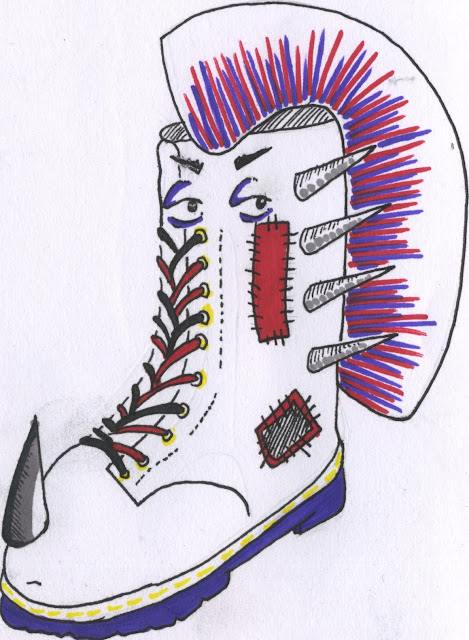
Here are my favourites of all my shoe drawings, and these are the few that I am going to decide from to form a narrative for. I have chosen a punk boots, some running shoes in a race and cowboy that has been walked all over by his own boots!
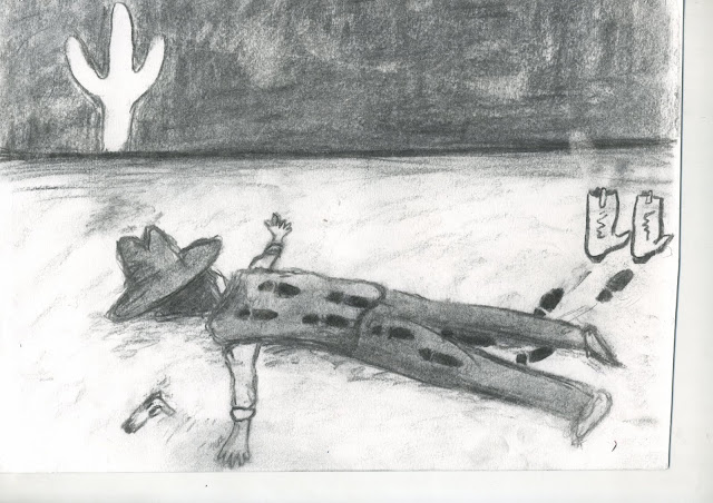
I have decided that I want to go with the drawing of the cowboy getting walked over by his own boots, I really like this one because I can form an interesting narrative from it. My next steps are now going to be to create 12 more images relating to this image and to create a storyboard for my developing narrative. I do like the charcoal technique I have used here and the the fact that it is black and white but I could possibly change the technique used here. I want to look at the different techniques that animators are using in the industry and see the ways I can make my drawings fit this and be more relevant rather than random techniques and materials.

I have decided that I want to go with the drawing of the cowboy getting walked over by his own boots, I really like this one because I can form an interesting narrative from it. My next steps are now going to be to create 12 more images relating to this image and to create a storyboard for my developing narrative. I do like the charcoal technique I have used here and the the fact that it is black and white but I could possibly change the technique used here. I want to look at the different techniques that animators are using in the industry and see the ways I can make my drawings fit this and be more relevant rather than random techniques and materials.
Peer Feedback - Captain Character
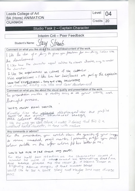
I received feedback on my character design and from this I am able to take next actions and develop her even further. I was also able to see what I was successful in when creating my character, it was said that there was good development, it had character appeal, it was an easy to remember character, there was good experimentation and the expressions were very descriptive. This reassures me that I am understanding my use of facial expressions and that they work well. I was also able to receive feedback on the visual quality of my work and my peers said that my work was presented so that my thought process was clear, the volume of my character was clearly displayed and the use of colour in my work, worked really well and showed the theme of my character. On the other hand, I was also able to get some critical points about my work to help me improve and it was said that I needed more key poses, there needed to be a clearer backstory when presenting my character and to redraw the rotation of the character as one of the 3/4 poses is on a slightly higher plain.
Wednesday 6 January 2016
Action Poses for Rihannon Rose
Action shots are a great way to see how my character moves and the way she reacts the situations in the narrative. I have shown a variety of happy poses as well as sad and thoughtful emotions to put my character more in the scene instead of just plain poses. I still feel like to develop my character even further I could either create more action poses or put my character into a background to establish her narrative a little better.


Subscribe to:
Posts (Atom)
Blog Archive
-
▼
2016
(96)
-
▼
January
(15)
- Turn Around Progress
- Turn Around - Rihannon Rose
- Creating Rihannon Rose!
- Research Into Turn Arounds
- Nausicaä of the Valley of the Wind Design Sheets
- Production Diary, The Other Side - 14/01/2016
- Production Diary, The Other Side - 12/1/2016
- The Incredibles - Character Design
- Production Diary, The Other Side - 08/01/16
- Storyboarding in Animation
- My Favourite Shoe Drawings!
- Peer Feedback - Captain Character
- Action Poses for Rihannon Rose
- The Colours of Rihannon Rose
- T-Pose - Captain Character
-
▼
January
(15)


