Monday 29 February 2016

The Good Dinosaur! - Environmental Storytelling


I wanted to discuss this film as part of my investigation into environmental storytelling as it is a good recent example of the animations that are coming out currently as well as I recently watched it for the firs time and really enjoyed it! The film is about what the world would have been like if the meteor that hit Earth had missed and the dinosaurs would have survived to be the more evolved species. This meant that the environments still had to look like Earth but in a way that is still beautiful and untouched by humans. I really liked this aspect of the film as it allowed the environments to be stunning instead of piles of dirt like Wall-E. This animation really raised the bar for a natural-looking world that looked realistic and flawless, the Pixar team used USGS data to build up their terrains and even satellite footage to build the clouds in the sky. I think that by doing this the film looks amazing and hyper-realistic, which is very impressive for an animation to achieve this effect.


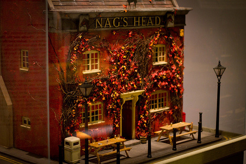
Here is the main setting for the film, 'Clawtooth Mountain' and this is truly a beautiful environment to set an animation almost as if they were trying to get the message across to the audience about how beautiful our planet can be. The production team were heavily inspired by The Grand Tetons, which can be seen below, and as you can see it's almost exactly the same. I have found that with a lot of animations they take heavy inspiration and usually almost replicate environments, this is why it is important for me to learn the skill of being able to go out and record different places that I find interesting.

Something else I found really impressive about this animation was the fact that even though it's a well known fact that water is extremely hard to animate they used the most water shots than any other Pixar film has done before with 125 shots. I felt like this really helped  bring the environments together throughout as without the water it wouldn't have felt as natural as it could have with it. All these aspects added together help to bring the environments to life and I loved that they went the extra mile with this film to ensure that happened.


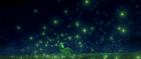
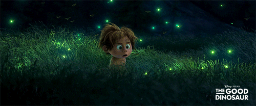
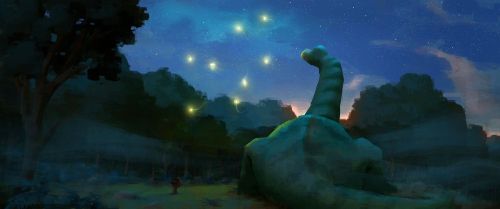
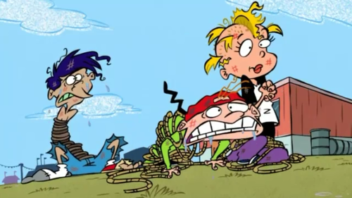
Finally, my favourite environment in this animation was the firefly scene, this one isn't very focuses on the background and more the animating but I still wanted to include it. I loved this scene because it really had a magical feel to it when everything becomes illuminated by the beauty of nature. To make it a little more relevant I have also included some concept art images of how the artists at Pixar imagined it to be, looking at concept art helps me to understand where ideas can come from even in such a simple environment or idea.


Sunday 28 February 2016

Walt Disney's Comics

When looking in sequential imagery it seemed that the main definition for 'sequential images' in a modern example would be comic strips or storyboards. As Walt Disney before becoming an animator drew comics for newspapers I thought it would be interesting to look at some of his early work to inspire myself to create my own storyboard for this project.

Looking at Disney's comics was really interesting as in his comics he didn't have to be so innocent with his characters and instead could appeal to an older audience. I liked this aspect  of it as in his animations there always has to be the consideration whether or not it is suitable for children. His drawings in these comics are really nicely done and they actually have quite a lot of detail in them. I noticed on the Donald Duck comics there is a lot of perspective used and you get a sense of space in each frame. I think this is something that is very important when it comes to framing your shot as you don't want each frame to look dull and boring. I also liked the fact that there's lots of extra little detailed in the backgrounds of his frames, for example the two little love birds behind Mickey and simplistic buildings across the road from Donald. These little details are another thing I think I need to consider more when it comes to creating my storyboard as even though these are comics it still follows the same rules of having to be able to get a story across with a singular images. 

Thursday 25 February 2016

Cowboy Art - Nelson Boren


As I have chosen to expand on my drawing of a cowboy getting walked over by his own boots I want to look at some artwork surrounding cowboys and the western theme to give myself some inspiration! I have found an artist that mainly works with the images of cowboys and his work is really inspiring to me as he uses watercolour really nicely.

Nelson Boren - Cowboy Artist | Western Art Prints | West Watercolor Artist:


I really like this piece by Nelson Boren as it focuses on the little details instead of the full cowboy, I think I'm going to create this kind of image for one of my drawings to make my study more interesting. By looking and exploring the small details in a character it helps you to understand them more and what should be put together to create a realistic character.


Here is another piece that I really liked, I mainly like the fact that you can't see the identity of the people and it leaves it up to the viewer to decide who they are. I want to use this technique in some of my own pieces and I feel like it's much nicer instead of giving the viewer the full person to look at which can be quite dull.


Finally, below is the last piece I'm going to talk about and I really love the way that Boren paints in these images. His paintings are hyper-realistic but with a touch of a rustic feel to them and this is something I would love to be able to recreate in my pieces! I definitely want to look at doing some watercolour pieces now and especially focusing on the cowboy boots as this will be one of my characters when I come to create a narrative.

More Sketchbooks That Inspire Me!


#so65 #sketchbooks I’m searching - Carnet de travail Élisabeth Couloigner:

To get myself more into sketchbooks and keep myself inspired here are some more really cool sketchbooks that I love!
illustrated by Wil Freeborn #sketchbook #journal https://www.flickr.com/photos/ghostschool/:

Geosophy: a situation around Malpertuis.:

Wednesday 24 February 2016

Fantastic Mr. Fox - Environmental Storytelling

Fantastic Mr. Fox is a truly a beautifully made animation and I wanted to not only look at the ways environments can be made up by being drawn or digitally imagined, I wanted to look at how they build the beautiful environments. So, for this animation they based all the sets and environments off a small town Great Misenden which was were Roald Dahl lived and as like most animations the production team were sent there on many trips to gather reference material. I feel like this is a very common theme for the designers and animators to physically go to the reference place before they go any further and by doing this it helps the environment to become more developed in the animation. Below is one of the beautiful creations and below it's inspiration to show how much inspiration the animation  really took from this town. This shows how important it can be to get little details right about your chosen environments as they effect everything about the animation.


There is a scene from the film below is one that I really like because it uses different perspectives to tell the story and this is another thing that I am learning about in the environmental storytelling project. The only thing is, is that as this is a set that is being filmed directly and not draw up they don't actually have to draw the perspectives, only move the camera but I still feel like it's good practice to explore the different perspectives and recognise them. Wes Anderson (Director) is known for using parallel shots and layouts in his film and this make a lot of the frames one point perspective, but I actually really like this way of framing as the audience is always focusing where you want them to.


In this clip you can really see the colour palette as it's very limited. As the environments in this animation are very dark but heavily detailed I feel like a lot of planning would have had to go in for them to be effective and not boring to the eye. Similar to when I analysed Wall-E they would have to be careful that they film wouldn't look unappealing when they use such a tight colour palette.

Monday 22 February 2016

Dream Worlds - Hans Bacher

I decided to do a little personal research into environments so I took out a book called Dream Worlds and this book was very interesting to read as it went through every element in production design and that is something that I am very interested in!

Bacher talks about how they went to France on a reference trip to look at castles that would inspire the one in Beauty and the Beast and they gathered many pictures, video and sketches. However, this was all thrown away as the art directors decided they should just go for the generic Disney look instead.


The book also looks at composition that you have to consider in animation and I found this section very useful! I did know a little about composition  but because this was written by a professional who actually has hands on experience in creating composition in animation I found it to by more useful than reading a book written by a filmmaker. Some basic rules explored in this book were that you could have different shots depending on the mood of the scene and after determining this it will actually help you come up with shots. It explained that to have a good composition you need order, rhythm and balance. The balance part was being able to deal with negative space as well as the layout you choose to use, below is part of a page from the book where it gives good and bad examples of composition. 


WALL-E - Environmental Storytelling!

As part of my environmental project I thought that I would look at Wall-E as it has no dialogue for the first half an hour and relies entirely on visuals to keep the narrative going. To develop my understanding further I also took out the book 'The Art of Wall-E' to give me a deeper insight into the creative decisions that were made and why.

The animation involves two completely different worlds, the spaceship and planet Earth. Earth is a wasteland and full of rubbish and dirt so to make it visually appealing would be quite difficult, the crew at Pixar said that they actually looked at a lot of photography of abandoned places such as Chernobyl. As the environments that the characters are in sets the tone and atmosphere it's important to carefully plan out each world and 'the more you know, the more believable your story can be' (Andrew Stanton at Pixar).


In the image above, Pixar have managed to create a world of litter and waste and still manage to make it seem like a place you would want to explore. By careful use of colour pallete they wanted to make it look like Earth but be careful not to make it look like Mars. In this shot above I really liked how they use their environments as part of the story and not just as the background for the action, in this shot the characters are watching the beautiful sunset yet still in a wasteland.

There is a one minute long scene in the film called "the walk home" which uses ten different sets and production designer at Pixar said they were 'the most complicated, largest series of ten sets'. Below I have put the clip showing the different sets they used and I really liked this little scene in the film, even though it was very short it was important to show the audience a little piece of Wall-E's world. Earth has been represented here as more of a wasteland rather than just a dump and I really liked to see how they had laid out the different sets when it comes to cinematography. One of the shots I really liked was the gods eye point of view shot as it accentuates the vast scale of the litter and waste as well as drawing the attention on how tiny Wall-E is in the world.

Location Development - The Bridge

As my first location I was going to use Leeds and Liverpool Canal but on location I didn't really like the place that much when I got there and it was so cold and windy that I couldn't draw properly so I decided not to go with it. Although, it was still an experience going and trying to draw on paper that kept flying away and having a very, very cold hand to draw with! Below are my drawings from location and some images I took there. My drawings are very rushed here and not very precise in perspective so I felt like it was just not worth trying to use this location if I didn't like it. It was especially hard to find a place to sit and draw as there were not nearby benches or anything really to sit on. I didn't have  that many different composition ideas for this location either and it was hard for me to imagine a scene apart form the obvious stood on the bridge. Anyway, I thought I'd mention this location even though I didn't use it as I still went to the trouble to go there and draw something.


Photographs from location:

My 12 Images for Visual Language

After drawing 24 drawings of shoes I then had to create 12 more images from my favourite, so I decided to go with the drawing where the cowboy has been walked over by his own boots. I picked this image because I liked the play on words and I felt that there was a solid story that I could easily follow and come up with a storyboard for. The new images I produced were fun to do and I was able to get a wide range of images from this one subject quite easily! I really liked using watercolour on this project so I used it in quite a few of my pieces and below I have inserted a few of them to show. I found it best to look at artists to inspire me as well as lots of cowboy photography and images from popular western films. I liked to focus quite a lot on the idea of cowboy boots because they can have so much character and different styles as well as my word being shoe.


Environments in The Incredibles - Architecture

As I am studying environments and how I can draw them up while still considering the cinematography in a scene I looked at The Incredibles. This I felt was a good example as staging, one of the main principles of animation, can be very hard to execute effectively and the environment and the way it is laid out of captured can drastically effect the staging.  The Incredibles is a great example of an animation that takes cinematography a little further and it is clear that it was really thought out and they used the theme of superheroes to the fullest.

The city that the animation is based in suggests that its based in a world that is very 1950s and 'post-war', based on the buildings and the colours and feel of the different environments like the image below. This is represented the the use of architecture in this animation and if you look throughout the film there are lots of architectural references throughout where famous buildings have been included to create the atmosphere of the city they are living in as well as suggest that they are living in an American  architectural city.


A good example of how they do this is to look at the backgrounds within the film, below you can see a large building in the centre of the frame that almost looks like the Chrysler building. This suggests that when drawing environments it's good to practice drawing buildings as they are essential if you want to create a certain look or feel to a narrative. Without the use of famous architecture that audiences recognise it would be hard to create the same atmosphere in the animation.


Saturday 20 February 2016

Perspectives in Animation


Here are a few examples I have looked at in animations where perspectives are used!

 This example in Spongebob Squarepants shows a one point perspective as all the lines are vanishing into a single point in the scene. This is used effectively to create a clear depth in the images as the first character appears much closer than the two guards at the other side of the scene.


Here a three point perspective is used in The Simpsons as the illusion of a very low angle is needed. The third vanishing point for this image will be above the objects and it is used very cleverly to create a 3D space while still keeping everything in the correct proportions.


Finally, in Ed, Edd and Eddy this is an example of a two point perspective as you can see it looks as though the characters are to one side of the building behind them and we can clearly see the corner. The vanishing points for this scene will be completely out of the image, but if you following the lines of the building it's clear where they are.

Perspectives When Drawing Environments!

Perspectives are very important to keep in mind when drawing environments as they allow for you to create three-dimensional space and depth. I want to look at the different perspectives that are used so that it can help me when I go out to draw my own environments.

ONE POINT PERSPECTIVE

One point perspective only has one vanishing point and uses a variety of orthogonal lines and transversal lines to make up the image. The one point perspective is most commonly used for drawing things such as roads, train tracks or hallways as these type of images only need one vanishing point.

Orthogonal lines are those that always appear to meet at the vanishing point and are straight diagonal lines that make the image appear to have depth. Transversal lines on the other hand are the right angles to the orthogonal lines and run parallel to the picture frame. Below is an image of the two different types of lines and how they work together to form the image. The green lines are the transversal line and the red are the orthogonal lines.


TWO POINT PERSPECTIVE

This perspective technique is slightly more difficult as it uses instead two vanishing points, and this also means that it has to have two sets of orthogonal lines too. This also changes the rules within the transversal lines as instead of being parallel to the picture frame they now become parallel to the ground plane. Below the image shows how there is two vanishing points now although, the tricky part is that the two vanishing points are usually completely out of the frame and this is something you have to try and imagine being there.

The two point perspective is the most commonly used technique and it is very useful in animations as it can create a more realistic scene rather than using a one point perspective. and I found a really good video example below explaining how you can physically use the vanishing points to draw your building.


THREE POINT PERSPECTIVE

Three Point Perspective from a Low Eye LevelThe three point perspective is a less commonly used technique as it is mainly used for looking up at buildings or down onto them. This however could be useful in animation if you wanted to exaggerate the height of something or plan out a scene that involves different levels of ground. This is the most complex perspective as it uses three vanishing points and three sets of orthogonal lines to create the image. As you can see in the image to the right, there are two vanishing points on the horizon just like the two point perspective, however there is an added point that is either above or below the object depending on the illusion you want to create. If you want the object to look large and towering then one vanishing point should be above, if you want to create a birds eye illusion then you should put it below.

Friday 19 February 2016

Turn Around of Pixie IN REAL LIFE!!!

Here is my turn around and for this I had to take images of each point that I felt necessary for my character to turn smoothly! I found that in my turn around I actually took a few too many images of my character and this creating the effect of having her spin speed up at a certain point, so in the future I think it would be a better option to plan out every angle and take either 12 or 24 images to ensure that everything is evenly spaced and the timing is correct.

Below is the images I took of my pixie character!