
Tuesday 29 December 2015
Production Diary, The Other Side - 29/12/15
I have been working over the holidays on colouring my scenes and tweaking them and putting in shadows where I think it's necessary. I only now have one more scene to complete and then I can start to put all of my scenes together, however I do not have Premiere Pro on my laptop so I will have to wait till I get back to college before I can start to do that! Below I'm going to put a line test, and this scene has been particularly tricky for me, I feel like my character does not move how I wanted him to. I'm going to focus on changing this scene when I go back to college as on my laptop I'm facing technical difficulties where the timeline will not play at the right speed so it's very hard to fix the timing of the walk cycle.

Tuesday 22 December 2015
Faces! - Captain Character
I've started to look at different faces and facial expressions for my character and I really like how this is turning out! I feel that by using her leaves as a way to tell her expressions works really well to bring my character together. My next steps will be deciding on a final body shape and face so that I can create a final design.


Monday 21 December 2015
Waking Sleeping Beauty - The Silver Age
As part of my research into the history of animation I watched the documentary 'Waking, Sleeping Beauty', which explores the silver age of Disney Animation Studios and how much the studio crashed in this time. After Walt Disney passed away the studios went through a time where they produced films that were mediocre and didn't have the same magic as they had once had and in the time period between 1984 - 1994, things had to change in the Disney Studios, otherwise they would end up bankrupt. Roy E. Disney decided that instead of relying on the same people that were already present in the Disney Studios that he would bring in people from the outside that were more business smart to bring more money into Disney. This was when the animation side of the studios were shunned away to another building and at this point the animators felt as though they were soon to be fired. The reason being for this movement was due to previous Disney animated films were failing and not doing very well in the film industry, as well as costing a lot of money to produce. Things had to change otherwise the animation side of Disney would soon have to be completely scrapped, so they had to come up with new ideals and techniques. They started to bring in things like Broadway musical scores to make the animations more interesting and entertaining, where they also brought in people like Alan Menken to encourage this. Menken inspired a lot of the animators as even though he had only been given the treatment to 'The Little Mermaid', he had written all the songs straight away so that they could be animated to. They also decided to bring in computer generated graphics into Disney's animations to give a new technique and look to the films, this really pushed the whole genre of animation as this was something new in the industry that Disney decided to push first. By coming up with all these new ideas and techniques, Disney started to flourish again as a company and soon they created 'The Beauty and the Beast', which was to be one of Disney Studios most successful animations. Although Disney did have a downfall in this time period, they still managed to bring it back with the main help of people like Micheal Eisner and Jeffrey Katzenberg who even though were not the talent and the animators behind the great films, but were instead the driving force of the company and the people that managed to save Disney from crumbling. They did this by asking the animators to come up with new techniques and ways of doing things instead of always thinking 'what would Walt do?'.
Friday 18 December 2015
Captain Character - Rihannon Rose
I have created a character called Rihannon Rose and she is a small fairy who is yet to be given her wings, first she has to prove herself and earn them. She will have to go on an adventure through the forest she lives in to collect all the elements, once she has collected these she can come back to her fairy kingdom and gain her wings. As she is only a young girl this is the first time she is leaving home!
I have started off by trying some different body types to see what I want my fairy to looks like, I want her to be cute but not look too distorted. I also want her character to be memorable and easy to recognise!


I have started off by trying some different body types to see what I want my fairy to looks like, I want her to be cute but not look too distorted. I also want her character to be memorable and easy to recognise!


Tuesday 15 December 2015
Osamu Tezuka
Osamu Tezuka was heavily inspired by Disney's Bambi and Betty Boop, which influenced the style that he developed as a manga artist. Tezuka became the first anime artist to tell stories simiar to way Disney had, he borrowed the style of round heads, bold lines and large, expressive eyes to create his characters. This soon became the house-style for the anime genre, and Tezuka had established the genre himself and inspired lots of animators after him such as Hayao Miyazaki, where his characters also featured the anime style. With borrowing styles from Disney, the anime genre was able to shoot off as they were able to easily express emotion with their characters and establish a style that anyone nowadays would easily be able to recognise. Without Tezuka, anime may never have gotten so big as it lacked a style that brought it all together and made it a genre. The anime style is clearly still present today as Japanese animations still use large eyes, and heavily expressive faces to tell their stories.


Friday 11 December 2015
The Other Side, Production Diary - 11/12/15
I had a crit session today with my classmates and in this we looked at each other's work so far and was able to give comments and discuss the next steps each of us should take. The issues that were discussed during my crit were that some of my shots seemed a little too quick, although it was hard to tell as my shots were all broken up and if they had been sewn together first it would have been easier to judge this. To tackle this I will have to ensure that my shots have extra room on the end of them in case they are to short when I come to edit them together, or I could try putting them together as I'm going to make sure I'm timing them correctly as I go. As a positive comment on my animation so far, it was said that everyone liked the colour palette I had used and that it was very eye-catching. Today I also almost finished on my scenes for the final animation and hopefully at this rate I will have it done during the Christmas holidays, giving me time when I come back to tweak things.
Thursday 10 December 2015
Very Early Animation! (PRE-FILM)
Before animation became anything near what it is today there was a lot of different ways that people figured out how to make things move. This was the very beginning and early stages of animation that is very simplistic and mainly involved only the upper class as the equipment was no accessible for everyone. The first example of animation being the Magic Lantern, which was an early predecessor to the projector, this made slides jump back and forth giving the illusion of a moving image. By creating a moving image, this was of course something very intriguing as people had only ever experienced a still image, as well as inspiring others to come up with new ways that they could make images move. The reason being for the strive of new ways to make images move, I feel was the desire for new technology as this was a time where inventions and creators were very popular. Animation then moved up where new pieces of equipment were developed and eventually animation became a form of entertainment for the masses. The development of animation could have been slightly encouraged by the idea of gaining profit from it, such as putting on shows and attracting an audience. Additionally, people saw it as a way of entertaining house guests with things such as Zoetrope, where animation really started to kick in and the upper class all had to own one for themselves. Flipbooks were also something that were popular in 1868 when they were created and this can still be seen as a modern day art form, which is pretty great! This also shows how animation has developed, something so little as a flipbook, which would have been very simple back then, has now developed to be crazy complicated books that are hundreds of pages thick and can tell a detailed narrative! The way animation has developed has been drastic and in this time period, even though so long ago, it was still developing rather quickly as new inventors came up with new equipment using only what they knew.
Ideas for SHOE
My first ideas for coming up with 24 images relating to the word shoe were simply just to draw different types of shoe, but I found that I was bored of this idea and that it was too bland. So, instead I decided that I was going to come up with lots of phrases that related to the word shoe and create different drawings that explain these. Here are a few that I personally like that I have found, some are still going to be the idea of different shoes as there is only so many phrases.
- Goody two shoes
- Shaking in your boots
- Big shoes to fill
- The shoe is on the other foot
- If the shoe fits
- These boots are made for walking
- Blue Suede Shoes
Below I have put a few drawings on mine to show how I have approached my word.


Walt Disney
Walt Disney, founder of Walt Disney Productions which is now one of the most successful and best-known motion-picture companies in the world! His ideas stemmed from experimenting with hand-drawn cel animation and inspired him to start his own animation business after working for different film studios. The reason that Walt Disney was so important in the animation world was because of his innovative ideas and the way he made lots of people from adults to children enjoy animation after having his cartoons shown before films in Kansas City Cinema. Disney was always motivated to keep making each animation better and better, and decided to use technicolour to create the first colour cartoon. By creating a coloured cartoon, this inspired other animators to start producing their work in colour too, which created a new direction for animation as it started to become more and more developed. When Disney came out with Snow White and the Seven Dwarfs, this also inspired animators globally, such as Japanese animators. Before the release of this full feature-length animation, Japanese animators believes that animation wasn't suited for feature-length film but this then inspired them to start making longer films. Osamu Tezuka, a founding animator for Japanese animation, was greatly inspired by Walt Disney's work and was the first Japanese animator to start to tell meaningful stories with animation, whereas others were still quite simplistic and aimless. Disney had such a large impact on the industry because he was a determined animator that put his heart into it, instead of always looking for the easy answer he created new pathways where other animators would soon follow.

Monday 7 December 2015
Winsor McCay
Winsor McCay was an american animator that became one of the pioneers in animation history, this was because of his new approach to it and he started to develop characters. He thought of his idea after being inspired by his son's flipbooks and this gave him the idea of executing this on different film frames. McCay also came up with the idea of repeated cycles of animation loops to cut down the time it took to create an animation, which is still used today. As McCay developed some very important techniques such as key framing, he really helped to move animation forward as it allowed for animators to plan easier and cut corners in some places. Without his development of the practice and famous Gertie the Dinosaur (1914), animation may not have developed so quickly after this point. What I particularly like about Winsor McCay is that his animations were made for the masses instead of being very out there and strange, this meant that more people started to like the idea and thought it was quite entertaining. What I have noticed about many of the pioneers of animation in history is that a lot start out as cartoonists and working for newspapers and I think this is where the ideas developed to creating such creative characters.

Friday 4 December 2015
The Other Side, Production Diary - 4/12/15
Like I had previously planned I managed to get a video of someone swinging an 'axe' so that I could animate it better. This helped me tremendously and I feel that in the future if I am animating any complicated movements of the body that gaining reference material is definitely beneficial to the animation! I have got finished 7/9 scenes of my animation now so I have a lot of material to show for my crit session, which will be a great advantage as I will hopefully gain lots of feedback. I also had a small progress review with Mat today and this helped by just making sure I was on track and things were going okay, from this I gained that I need to watch 'Waking Sleeping Beauty' to help with my animation history research and that to gather audio I could look at Free Sound Project, BBC sound library or UB sound. As long as I keep going at the speed I am, I am going to be on track and will still have time to go back and refine my animation over the Christmas break as well as when we come back before the deadline. This will give me a overall better animation as none of it will be rushed, below is some videos of reference material and then the rough scene I created from it!
Wednesday 2 December 2015


Tuesday 1 December 2015
The Other Side, Production Diary - 1/12/15
Today was just another studio day for me, where I carried on with my animation and it's going really well. I tried to animate a scene where my character goes to chop a tree, but I found it very difficult by using videos from the internet so my next plans are to record someone swinging their arms as if chopping a tree to get the best result. This way I can go through frame by frame and draw up my animation correctly without it looking unrealistic! I have quite a few scenes that are pretty much finished and I feel that to keep on track I need to do a few more blog posts on the history of animation to keep on track. Also, the last thing I need to start collecting is my audio which I'm unsure on where I am going to source this from yet.
Below is a clip of one of my finished scenes, I am going to wait til my crit session before I start to make small changes on them so I can change what others notice can be tweaked.
Below is a clip of one of my finished scenes, I am going to wait til my crit session before I start to make small changes on them so I can change what others notice can be tweaked.
Monday 30 November 2015


Sunday 29 November 2015
Tarentino's Gods Eye
As one of my inspirations for shot types is Quentin Tarentino as one of my favourite directors and I decided that I was going to use some of his famous shots in my own animation to make it overall more interesting to watch. I really love the God's Eye POV shot and I have decided to use it when my Lumberjack character is looking up at the tree he's about to cut down, I feel like this shot type really emphasises the vulnerability of a character as well as giving a better sense of the mise-en-scene.


Famous Shoes
I decided to look at some famous examples of shoes in order to inspire myself into what I want to create with my 24 drawings. I need to consider; types, styles, classifications, shapes, similarities and differences in shoes.

Before I look at famous shoes, I'm also considering how many types of shoe there are and there's quite a lot!
 Forest Gump's Trainers
 Dorothy's Red Slippers
 Cinderella's Glass Slippers
 Marty McFly's Self-tying Trainers
By looking at these famous shoes I've started to think of different ideas that I could maybe do in the long run when having to create a narrative! All of these shoes have a story behind them and I feel like I could either go down the route of having a person attached to the shoes, or have them be their own being. I like the idea of shoes having a mind of their own and the Marty McFly's example would be great for this and could possibly be evil shoes.
Before I look at famous shoes, I'm also considering how many types of shoe there are and there's quite a lot!
Forest Gump's Trainers Dorothy's Red Slippers Cinderella's Glass Slippers Marty McFly's Self-tying TrainersBy looking at these famous shoes I've started to think of different ideas that I could maybe do in the long run when having to create a narrative! All of these shoes have a story behind them and I feel like I could either go down the route of having a person attached to the shoes, or have them be their own being. I like the idea of shoes having a mind of their own and the Marty McFly's example would be great for this and could possibly be evil shoes.
My Animatic for The Other Side
This is my animatic that I created in order to plan out my final animation and get the timing of the shots right so that I didn't waste any time when coming to animating. I found that this method was much more easier than doing a storyboard as it really allowed for seeing what the final animation would feel and look like without even starting on it yet. Looking at my animatic I feel that the timing goes well with the amount of shots I put in, originally I had put in more but after decided that it didn't need to be so complicated. I put in a few sounds to make the animatic more interactive, however I feel that some of them are going to change quite a lot in my final animation, such as the noise of the lumberjack trying to pull out his axe. I am now ready to animate and I'm going to make sure that I keep on referring to my animatic to ensure I don't waste time by drawing extra seconds here and there that I do not need!
Friday 27 November 2015
The Other Side, Production Diary - 27/11/15
Today I carried on with my animating and I got to colour in the first two seconds of my animation and move on to the next few seconds. I feel the main thing I need to keep remembering is secondary action as I feel myself slipping out of remembering this principle and some actions can seem a bit robotic and not natural. However, I am making sure to constantly line test after I feel I've made some sort of progress. As long as I just carry on as I am, I'll hopefully get a reasonable amount of my animation done before we break up for Christmas, which is one of my main goals.
Tuesday 24 November 2015
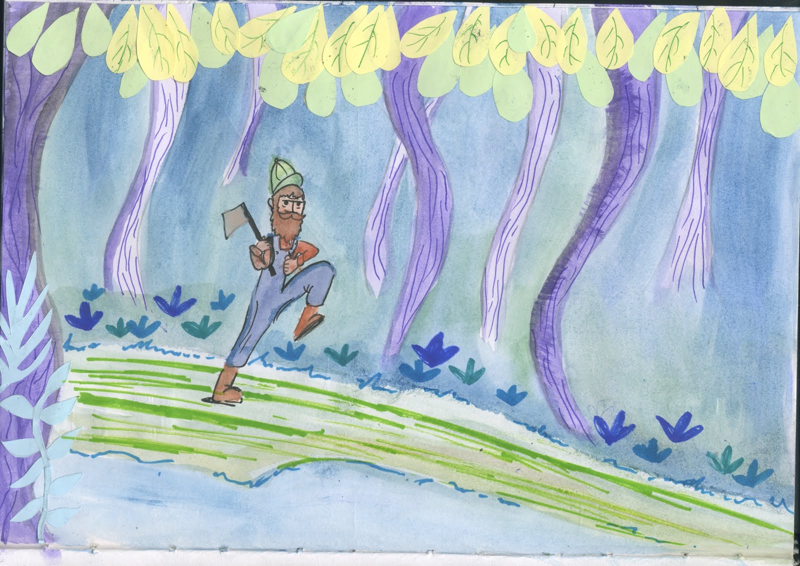
The Lumberjack Final Design
Before I could go on I had to come up with my final design for The Lumberjack character, and here he is! I made his colours match those on the backgrounds so that it is all matching, I decided not to got with the emblem on this outfit to make the animating slightly easier as this might have made it more complicated. Overall, I like how he looks, he's nice and simple and I'm happy with him as a character.


Backgrounds for The Other Side!
Here are the final backgrounds I've been working on for my animation!
I made sure to have a magical looking colour palette for these so that it gives the right mise-en-scene, and I looked at the concept artist Mary Blair for my main inspiration.


I made sure to have a magical looking colour palette for these so that it gives the right mise-en-scene, and I looked at the concept artist Mary Blair for my main inspiration.


The Other Side, Production Diary - (24/11/15)
My Interim Critique was today and I had set up a presentation and animatic to gain feedback from, it went well and I received positive feedback! The feedback I recieved was that I have a good story and the timing in my animatic worked really well, this was the main thing I was concerned about. I also got feedback that my developmental work was well documented and that it's clear that my ideas have developed over time. I am going to take away from this feeedback to really keep doing what I'm doing and to make sure that I really stick to my plans and avoid straying off so that my project is successful. I also made lots of progress today with my final animation. After recieving the feedback I went straight on and started my animation, I was able to finish all my background to animate on top of as well as start to animate my first scene. I managed to get 2 seconds done but not fully coloured up yet, I'm going to leave that til the end!
The History of Animation NOTES
Pre-Film - c. 1650-1899
- 1815 - Magic Lantern - early predecessor to the projector (2 slides of glass back and forth)
- 1824 - Thaumatrope - A disc of card that displays an image when it is rapidly spun
- 1831 - Phenalistoscope - A disc with an image sequence on one side and radical slots, viewed in a mirror
- 1834 - Zoetrope - Similar to the Phenalistoscope but a cylinder rather than a disc, this is where animation really started to kick in
- 1868 - Flip Books - A book which when flipped through, generates an illusion
- 1877 - Praxiniscope - An improvement on the Zoetrope using central mirrors instead of slits, neater way to see
Silent Era - 1899-1924 (Artists began to use film to record their animations and were often accompanied by pianists!
- 1899 - Arthur Melbourne-Cooper - Matches an Appeal, this is the first known animation and it was British
- 1906 - J.Stuart Blackton - Humerous Phases of Funny Faces, pioneer American for animation and this is traditional animation using film, he uses chalk and cut outs
- 1907 - Katsudo Shashin - Unknown Author
- 1908 - Emile Cohl - Fantasmagorie, this was considered to be the first narrative animation
- 1910 - Ladislaw Starwicz - Beautiful Lukarida, an early example of puppet based animation
- 1914 - Windsor McCay - Gertie the Dinosaur, Real example of traditional animation where they actually have character design
- 1917 - Quirino Cristiani - El Apostol, 70 minutes of cut out animation. another pioneer of animation as this was the first feature length
- 1921 - Walter Ruttman - Lichtspiel Opus I, pioneer of abstract animation
- 1923 - Walt Disney - Alice Comedies, on the corner of the golden era, this was Walt Disney's first project that composited real action with animation
The Golden Age - 1923 - 1960s (The animation industry took a big hit when television became an affordable alternative to going to the cinema, talkies came in)
- 1924 - Max & Dave Fleischer - Song Car Tunes, the first series of animation to have sound
- 1928 - Disney - Steamboat Willie, first animation with completely synchronised sound
- 1931 - Quirino Cristiani - Peludopolis, the first feature length animation with sound at 70 mins
- 1932 - Disney - Flowers & Trees, brings in colour to animation, RGB three-colour technicolour, and had a very limited colour palette but won the first Oscar for animated film
- 1935 - Tex Avery - Gold Diggers of '49, first animation from Warner Bros
- 1937 - Disney - Snow White & the Seven Dwarves, the first feature length film with three strip technicolour, very popular and demonstrated that animation should be taken seriously as a form of media
- 1945 - Mitsuyo Seo - Momotaro's Divine Sea Warriors, first feature length anime
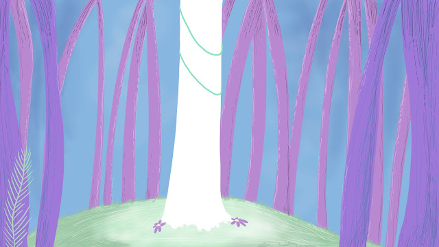
Tree Spirit Final Design!
Here is my final design for my Tree Spirit character! I really wanted this character to look very feminine and took inspiration from images I had found from Pinterest and online sources. I feel like she looks how I want her to and hopefully my animation will be successful in the way that I will be able to keep her consistency to whole time.


Monday 23 November 2015
Inspiration for The Other Side
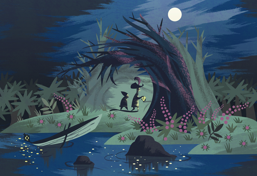
As part of my inspirations I looked at different cartoons that I liked and looked at how their layouts were to inspire my project. First I look at Looney Tunes and I really loved how they used simple and bold characters that would be easier to animate alongside soft, subtle backgrounds. This gave me the idea of putting a lot of time in to the backgrounds in my animation to make them look appealing and I felt that by doing this I would be able to make my animation look more appealing and interesting to look at. Below you can see how Bugs Bunny and Porky Pig really stand out against the background, which uses pastel and light colours in order to not take too much of the audience's attention. I am also interested in using light colours in my backgrounds so that I can create much the same effect.
Next I looked at other animations which used the same technique and I found that this was a common technique that is used! Below I have put a few examples of other cartoons and animations that use beautiful backgrounds behind their animations to bring it all to life. Without these backgrounds I feel that the animations would look either boring or out of place and wouldn't really establish the narrative that the animators are trying to get across, so the backgrounds are really an important aspect.


Next I looked at other animations which used the same technique and I found that this was a common technique that is used! Below I have put a few examples of other cartoons and animations that use beautiful backgrounds behind their animations to bring it all to life. Without these backgrounds I feel that the animations would look either boring or out of place and wouldn't really establish the narrative that the animators are trying to get across, so the backgrounds are really an important aspect.
Mary Blair
For one of my main design inspirations I decided to look at one of my favourite concept artists Mary Blair, who worked for Disney in the earlier days. I really like her work because of her use of colour and it was very inspiring to me when looking at her artwork to create a similar style for my animation. By doing this, I am able to think carefully about my colour scheme to bring my whole animation together and make it more professional. Below are a few examples of Mary Blair's work and I particularly like how she layers up her images and after researching I found that she uses watercolours, pastels and cut out shapes to create her images. I have created a scene (shown below) much like Blair's using her materials just to test out whether I really liked her technique however, as I am creating a 2D animation using Photoshop this will not be possible to me however I plan to create a scene much like Blair by using layers in Photoshop.

Here is my inspired piece.

Here is my inspired piece.
Friday 20 November 2015
The Other Side, Production Diary - (20/11/15)
Today, I have learnt about the history behind animation and how animation has evolved over the years which was early interesting. We went through the Silent Era to the Golden Age and I am going to continue my research into the Silver Era of animation so I get an even better understanding of the history. My favourite part of the history was looking at the Golden Age as I prefer the animations that have sound and are more interactive, although it was still interesting to look at the older forms of animation and the ways they figured out how to make images move; such as tying a piece of card between two pieces of string. My goals now for the rest of the day is to get a bit more development done and I plan to digitally draw up some of the backgrounds on Photoshop for my animation to see if I want to do it digitally or paint them and scan them in to animate over the top. Finally, I am going to work on looking into audio style as this is something I am yet to consider for my animation.
Tuesday 17 November 2015
Animatics in Animation
Animatics are basically a moving storyboard and I decided to look into the history of them and why they are used in order to inspire me and so that I have a better understanding of them. So, when they were first introduced, animators would actually just videotape the drawings but now it has become a lot more digital and we can used editing software in order to create a more precise animatic and include a soundtrack. I found a couple of animatics that I liked and have put down below and by looking at existing animatics it helps to inspire my own. Animatics are really useful as they allow animators to see what works and what doesn't before going in and spending lots and lots of time animating these scenes. I feel that they save a lot of time and a quick way of almost seeing how to animation will look in the end without it actually being any way near finished. Without using an animatic the animations could possibly not work as well and also they allow for feedback before the animation has gone into the production stage.
Friday 13 November 2015
The Other Side, Production Diary - (13/11/15)
Most of my ideas I feel now are pretty solid and I am happy with the narrative I have settled with so I felt it was time to start on a rough storyboard, which is what I did today. I feel like this went really well and I am taking inspiration from Disney for the look and feel of my forest in my animation so I was sure to look at lots of different Disney storyboards on Pinterest and online to see how they laid out forests. I also looked at lots of different shot types such as wide shot, god's eye POV shot and different angles so that I could portray my characters in the right way. I sketched a storyboard up and I'm quite happy with the results. I then went on to create my first draft of my animatic and this went quite well as I was familiar with the program Premiere Pro so I didn't have any technical problems. After chatting with Mat he has suggested I take a few shots out as it's too complicated for the time I have so I'm going to have a look over the first shots of my lumberjack walking through the forest as I have a lot of shots for that scene.
Tuesday 10 November 2015
The Other Side, Production Diary - (10/11/15)
I did some character research today and I decided to go with a different idea than I had originally come up with. This was because I wanted to create a narrative that was simple yet had some humour to it originally and if I would have gone with the idea of having a little cow jumping over a fence it was a little too simple and didn't have enough narrative. Instead, I have decided to go with a story of a lumberjack going through a forest and he sees a beautiful white tree, which he then goes to chop down. Into his first chop a the tree his axe gets stuck and this wakes up the magical tree spirit that he's trying to chop down. Her reaction is that she decided to turn the man into a frog and he jumps out of a pile of clothes. I am also thinking of adding a small Easter egg into the animation where I could possibly put a crest on the lumberjack's clothing to hint him being of royalty, possibly a prince?

Thursday 5 November 2015
The Other Side, Production Diary - (05/11/15)
Pinterest is a great website for coming up with ideas and creating inspiration for yourself so this is what I have been focused on today so that my ideas become solid. I am thinking about changing my original idea as I'm not sure I like it very much. Below I have screenshotted my Pinterest board to show the kind of images I'm looking at for inspiration and I am really liking the idea of having a lumberjack cutting down a tree and having a twist in there somewhere. I also have been looking at different storyboards and how they can be used most effectively. Below you can see a shot of a Snow White storyboard and I thought this was interesting because you can see how they have put a square to the camera movement. By looking at Pinterest I know that I want to look at a new idea and really focus on getting a solid and interesting storyboard.


Tuesday 3 November 2015
MAID OF THE DEAD
As I looked at a claymation that was American and quite gory, I decided to look at a Japanese one to compare the two. In this animation it uses gore but then makes it comedic and I have found that the Japanese claymation includes a lot more gore than say the American one; like I predicted. I like this animation more than the other because it has a better narrative to it, as well as the characters having more character even though they don't have any introduction like the other. I found that this one reaches a larger demographic, still older, as it doesn't have a soundtrack that could influence the audience's views and it's also in English and Japanese so can be understood by a lot of people. This animation is successful as it is funny, which makes it more memorable and makes people want to see more like this. I also like the fact that it's not too long and manages to keep your attention without getting too complicated. The medium used is great again because anything goes with clay so unrealistic things can be made to look relatively realistic without grossing someone out too much, like pulling someone's guts out. Overall, I feel like this claymation is much more successful in the way that it has a better narrative with humour instead of being a dramatic horror scene in a typical setting.
Love Automatic - NIGHTMARE [official video (18+)]
This was a claymation that was created as a music video, which I came across when looking at a few different claymations on YouTube. I really liked this video as the use of clay really helps create every effect successfully within the video, if they used any other medium it might not have worked as well as they were able to create melting bodies ect. I feel like there isn't a message behind this video, but instead it's something different to attract audiences to watch the video even if they didn't know the song, therefore making it more well-known. The demographic for this video is clearly an older audience as it has gore in it, but it might have also been considered that the video had to be aimed at the same audience the music would have been so they would work together effectively. I think this is an American made video, which is clear from the horror clichés that are used and often found in American horror films. This might differ if a Japanese company produced this video as comparing their horror genres there is a lot of differences to be found. As the band are also American it would have made more sense for American animators to create this.
ATORMENTA Sand Animation
Sand animation is something that is quite different and really shows how animation can come in forms that may not seem very obvious. This animation is a very short one so there isn't much of a message apart from a narrative about a little girl, although it still manages to use it's medium to create the atmosphere of a storm successfully. Target audiences for this animation isn't so clear either, mainly because it is so short, however it would likely be for an older audience due to the twist in the narrative. I like this animation mainly because it was made entirely with sand and salt and the technique is really interesting to me.
Ideas for 'The Other Side'


These ideas are just some basic ones that I have not yet developed any further, I am not sure yet whether or not I am happy with any of them and so that I stay inspired throughout the whole project I want to find a subject that really interests me. I feel that by looking at Pinterest it will help me gain even more ideas and maybe develop some of the ones I have already come up with!
The Other Side, Production Diary - (3/11/15)
Today, I was briefed on a new project called Process and Production and my main task for this project is to basically come up with a 25 second 2D animation that has a narrative. I am excited to start this project as I feel that it has quite a lot of freedom with it as I can literally do anything that's relative to the words 'The Other Side'. I have come up with a few ideas today after doing a few brainstorms and I'm not sure which one to settle on yet and I have also done a few sketches to get a few ideas going and hopefully I'll be focused on my subject soon!
Line Test for Flower Happiness Animation

This was my first line test to ensure that my 2D animation was going right, this is 12 frames of the final 60. I feel that looking back at it to make my animation better next time I could make the feet more grounded and keep an eye on this just to make the characters feel more real. Also, something I noticed was the fact that the male character's head floats back and forth at times which could be something else to keep in mind when creating my next animation so that my animations look more precise.
Monday 2 November 2015

Thursday 29 October 2015
The European Refugee Crisis and Syria Explained - Infographic
Here I found an infographic that is extremely controversial and seems to be very bias in the things it says and suggests. I feel that it's purpose was probably to cause controversy as it puts down huge countries such as America, Australia and the UK and calls the residents xenophobic, quite a heavy assumption. This infographic was made to educate others, but I feel it has been very subjective instead of objective; unbias infgraphics are more successful in my opinion. The media used is very colourful and quite happy looking considering the topic it explores, possibly because it is trying to communicate a light-hearted approach. It is clearly reaching out the the western world as it encourages people to donate, yet it discriminates against these countries and makes the audiences feel guilt, which I'm not sure if this was a technique used on purpose. I find it quite odd how the narrator is English yet says bad things about the UK, but this is again to possibly cause controversy. Overall, I didn't really like this animation, even though it looks good aesthetically, I felt like it was quite bias and pointed the finger at a lot of places and that felt quite unprofessional.
Hyrule Warriors - Opening Cutscene (Japanese Wii U)
I decided to look at one of the cut scenes for a Japanese game to see how they differ and I have found that in this example there is no voice acting only script coming up along with the animation. This is quite different to the Fable cut scene I looked at which has voices and a narrator all the way through and I think this might be because of the different cultures. Japanese may not mind that there is no voice acting whereas an English or American audience would much prefer this. I really like the character's design in this animation as they were well developed and it was clear who were the main characters throughout. The message that was being communicated wasn't too clear to me as I cannot read Japanese, although I feel that it would be clear to Zelda fans even if they didn't read the script, of course they could just change it to English. I feel that sometimes without voice acting the scenes feel less realistic and it's very clear to you that you are playing a game, which I personally dislike. This animation is clearly the starting point of the game and is reaching out to players to distinguish a main storyline that will be followed during the game.
Fable III - Opening Animation
This opening cut-scene for the video game Fable III is one of my favourites and it's purpose is to start to establish the kind of world the game is set in as well as start to excite the player as it questions at the end 'who will lead the revolution?'. The whole animation is a kind of metaphor, the hero being you who will make a leap of faith like the chicken does in the cut scene. This is a video game created by an English company Lionhead and I feel this is very obvious in the way the game is set along with the characters involved, even the narrator is English, which differs from other types of games as most popular ones are made in America as it has a completely different aesthetic. I feel this is because Fable is clearly set in old style England and they have exaggerated and used this to the full in the game, unlike American games where they are never really set in this kind of environment. I really like the whole idea behind this cut scene and the message of the chicken being the hero, although he comes to a bad end.
Wednesday 28 October 2015
Father and Daughter - Dutch Short Film (2000)
Here is another short film I have come across and I really liked this one much like the other short film I analaysed as they both have no dialogue involved but still manage to create lots of emotion. This animation follows the story of a father and daughter, and he committed suicide without her knowing and she goes back to see if he will return for the rest of her life before eventually meeting him in the afterlife. I feel that this animation is trying to send the message that suicide happens even to the people we thought we knew best and I feel that it could be reaching out to a lot of different audiences rather than just one. It doesn't have too much detail and development on the characters involved, which leaves it open to audiences relating themselves to the characters. As it is a Dutch animation it would slightly differ from animations that were made by places like USA as it is not as direct and lets the meaning fall up to the audience instead of making it very clear. This animation is successful as it really pulls the heart strings with it's use of symbolism, simplicity and soundtrack, all contributing to the overall atmosphere of the short film.
Monday 26 October 2015
OREO Canada Wonderfilled Anthem (Full TV Commercial)
In Canada this is one of their Oreo advertisements that shows on TV, which we have a similar version in the UK. I think it's purpose is to not only advertise Oreos but also to make out the idea that if you eat Oreos you will be happier as it uses the example of the big bag wolf and that it changed him (a story known by everyone). The animation is very colourful and quite fun and keeps expanding on the word 'wonder' to give the audience the message that Oreos are wonderful subconsciously. I feel like the way it's animated is very flow-like and this relates to the idea of milk and the way it flows as a liquid, this is an effective way to make the animation relative to the idea that is being put across. I also feel like they are trying to target as many audiences as possible with this advertisement as toward the end it repeats 'I wonder if I gave an Oreo' while showing lots of different hands in all shapes and sizes, suggesting it is literally for everyone in the world not just one type of person. As it is a Canadian TV advert, I feel like they're made it very happy and bright which may relate to the stereotypical view of Canadians which is that they are happy people, but this is only an observation. I think it's a really effective advert not only because the animation is so smooth and flowing but because it uses a very catchy theme song, which after being repeated on TV a few times to audiences will soon start to stick in their mind.
The Girl Effect - The Clock is Ticking (Infographic)
This is an infographic I have found on the internet that I really liked because it actually had a meaningful message behind it and used different techniques to make itself stand out. I feel like the use of a infographic here is a great method instead of any other type of animation as you can pack lots of information in without it becoming boring. The subject it explores is something that a lot of people might turn off to when they hear about it but by using an infographic it forces the audience to keep watching in order to find our what is happening next. I also feel that the audience is those who are living comfortably in the western world and don't quite understand the struggles that young girls are facing in other countries because they don't see or experience it themselves. The animation itself is trying to communicate that these girls do need help and without it could effect you indirectly as the virus HIV would be more likely to spread across countries (76 at that!). I liked this inforgraphic as it was really simple but still managed to get quite a long and informative message across without making it too crammed and overwhelming.
Grave of the Fireflies - Studio Ghibli
From Studio Ghibli this is one of the most heart-wrenching of all of their animations due to the message and story it is telling. I feel that Studio Ghibli made this animation to show a different side to how war can effect ordinary people who would have normally lived happy lives, and leaves it up to the audience to decide what they think about the subject of war. They possibly were trying to get the message across that children can often be forgotten about when it comes to war, left to fend for themselves. As the film is set in Japan it could be hard for people to connect to it, but they have made the main characters children in order for a variety of different ages to be able to connect with the narrative. *SPOILER* Setsuko's death in the film really has a massive effect on the narrative as you begin to understand that Seita was only a child himself, even though he did act like a parent to her. I think that this film is so successful because it grips it's audience straight away with the haunting scenes of war and then an unbreakable bond between two loved ones. This has to be one of my favourite Studio Ghibli films due to it being able to touch anyone's heart even if they've never been through anything like it in their lifetime.
Designed by Apple - Intention (2013)
This is quite a different kind of advert in comparison to most of Apple's advertising as it's completely animated and features none of their products directly. I feel they were trying to target an audience that were looking to be inspired and sending the message that as a company they go through many processes that include getting shut down and trying again and again. As Apple is an American company the advert is in English, but there is no commentary to go along with it just simple instrumental music that is uplifting in itself. I liked this fact as it didn't pin point any particular audience such as male or female it was very simple and dynamic to whomever would come across it. I think this animation is quite effective and successful in the way that it is so very simple but still puts across a strong message. As the animation is constantly moving and changing it also successfully keeps the attention of the audience which is vital within an advertisement.
The House of Small Cubes (La Maison en Petits Cubes) - Japanese Short Film Animation (2008)
This is a short film I came across produced by a company called Robot Communications, animated by Maya Asakura and Yoshie Fujiwara. This is a Japanese animation yet it has been made so that it gives a French dreamlike vibe and it would be difficult to guess it was created by a team of Japanese animators. I really like the diegetic sounds used in this animation even though there is no dialogue when the man is sitting down for dinner you can hear a variety of the waves crashing outside, the seagulls squawking ect. There's also really nice instrumentals used with a piano and this also adds to the atmosphere, especially in the scene of his child being only baby where the notes become angelic sounding. The meaning behind this animation is that people's lives do just fade away and faces a subject that we will all eventually have to face in life. The audience for this film I feel is of all ages as it attracts younger audiences with the children's-story-book effect and especially those who are older and do go through the phases of looking back on their lives. Even though this animation may be quite cultural with the way it suggest French themes, I still feel like it represents what every human being goes through and that is why I think its so heart-wrenching and successful as it won an Oscar for Best Short Film.
Sunday 25 October 2015
Appeal or Character Personality - Principle 12
Characters in an animation should always have what is called appeal, this doesn't necessarily mean god looking but it means interesting to look at. They also need to be developed in the way they look, this could mean playing with proportions but always keep it simple as you will have to draw these characters over and over. Characters not only need to look appealing but they also have to have an appealing personality so that the audience will be emotionally engaged with them, if your character's personalities are bland and boring, audiences may lose interest. I found a good example of how you can play wit the proportions of characters in order to make them more appealing. Below you can see how each character can be representative of a shape and this makes them much more interesting to look at instead of all being the same shape.

Solid Drawing - Principle 11
Solid drawing really is just the basic principles that surround drawing, this could be form, weight and volume and this is something you could have naturally picked up along the way but are still vital in animation to make sure your drawings are realistic. What is important to remember is to keep the illusion of a three dimensional space in your drawings, so that nothing appears flat. It helps to always use 3D objects such as spheres, cubes, cylinders that help to create dimension instead of using circles, squares ect. Also, using parallel lines can be a downfall that you may come across and it will look more realisitic and dynamic to use curved and straight lines together as straight lines together just look flat. The example below shows how you can use 3D shapes and create a character from them, I liked this example as the notes are very helpful and it has lots of different examples are stripped right down to the very basic to show you exactly how important it is to use different 3D shapes instead of using flat ones.
Exaggeration - Principle 10
This principle is not just about making something be bigger or faster and it's not about making something more distorted, it's about making something more convincing. Exaggeration can also be about subtle characterisation of expressions, poses and facial features. Most of the time exaggeration is used to make an animation seem more interesting and to make the idea of the action seem more apparent, so when an action is quick the exaggeration has to be more extreme in order for it to be noticed. I have put a great example below of how you can take the simple action of eating chocolate and completely exaggerate it to make it seem much more interesting. There's another example below of an animation created by Chuck Jones who is very original in the way he uses exaggeration, instead of always going for the massive exaggeration, which he still uses, he also uses very little exaggeration that is still really effective. I liked this example as the frog makes little to no facial expression yet you can still understand his emotions with the way his body is drooped. 

Subscribe to:
Posts (Atom)