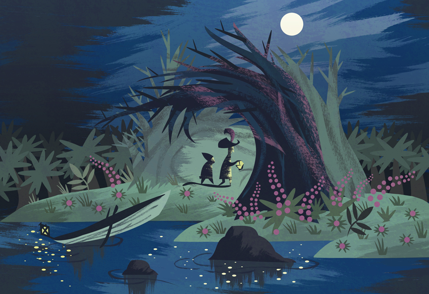
For one of my main design inspirations I decided to look at one of my favourite concept artists Mary Blair, who worked for Disney in the earlier days. I really like her work because of her use of colour and it was very inspiring to me when looking at her artwork to create a similar style for my animation. By doing this, I am able to think carefully about my colour scheme to bring my whole animation together and make it more professional. Below are a few examples of Mary Blair's work and I particularly like how she layers up her images and after researching I found that she uses watercolours, pastels and cut out shapes to create her images. I have created a scene (shown below) much like Blair's using her materials just to test out whether I really liked her technique however, as I am creating a 2D animation using Photoshop this will not be possible to me however I plan to create a scene much like Blair by using layers in Photoshop.


Here is my inspired piece.


No comments:
Post a Comment